Streamline your team’s software projects & Using mental models for better UX design
In this week's issue of Creativerly: Smart team messaging for better thinking, why sleep deprivation kills, how to recover after burnout, and a lot more.

You are reading Creativerly, the weekly digest about creativity and productivity-boosting tools and resources, combined with useful insight, articles, and learnings from the fields of design and tech. The newsletter built for the creative community.
Hey and welcome to issue 72 👋
In Creativerly #70 we briefly talked about the launch of HEY, the new privacy-first email service brought to you by the Basecamp team. HEY was all over Twitter, discussed by thousands of people. The product got so hyped up, that people even tried to sell their invites, and others wanted to buy usernames. Just crazy when you think about that.
Besides HEY there was a second digital product which also gained a lot of attraction over the last couple weeks. I am talking about mymind by Tobias Van Schneider. As most of the nowadays digital tools, it is invite-only. I tried mymind for the last couple of days, and I have to say after reading their manifest beforehand, I was indeed hyped up. Let’s quickly jump into what mymind actually is. If you bring it down to the core feature it is a bookmark manager, which also gives you the opportunity to quickly store notes, which you braindump into a neat-looking UI. The biggest selling point of mymind is the fact that you do not have to worry about where to put your bookmark or where it actually went. You simply save an image, an article, a note, and you are done. If you want to come back to it at a later point to just hit the search bar and type in whatever you associated with the specific image or link. Mymind is based on artificial intelligence which handles all the tags, categories, general structure for yourself.
Sounds great so far. But it is 100% not what I want for all my important links and bookmarks. Let me tell you why. I save a lot of things every single day, most of them for myself, but a lot are also for my newsletter. Therefore, I need a certain structure, folders, hierarchies. Just dumping everything into one place and using the search every single time to just find one item, is not what I want for my mind. My mind needs a certain structure to quickly find the things I need. For this purpose I use raindrop.io which lets me create unlimited collections, unlimited tags, unlimited items. It looks good, is fast, multi-platform, and it is free.
How do you manage your bookmarks? Do you use a specific tool to create some kind of structure or do you store everything in your preferred browser?
If you have recommendations or feedback, drop me an email or a tweet. For now, enjoy the newsletter! 🥰
Apps, Software, Tools
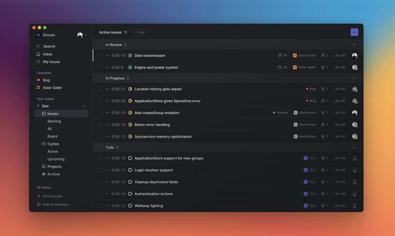
Linear →
At Linear, we are creating software for teams who want to build high quality products. Linear helps to streamline your team’s software projects, sprints and tasks. Integrated with Github, Gitlab, Figma and Slack. On MacOS, Web and Mobile.
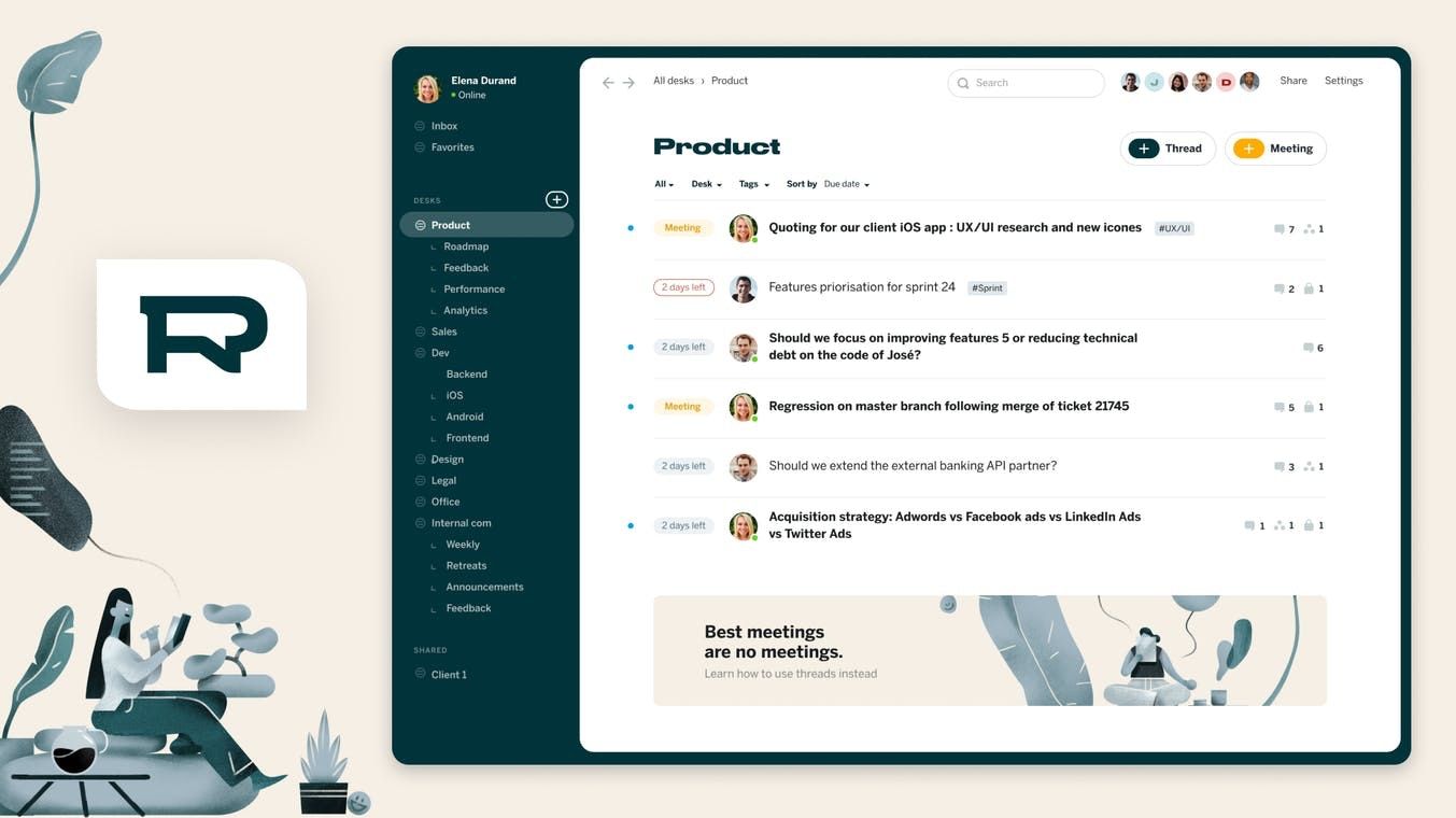
Redesk →
Redesk is the async messaging app for teams with built-in goals, deadlines and upvotes. It offers a different way to communicate using asynchronous messaging, thoughtful and long-form messages to reduce noise and interruptions at work and promote remote work.
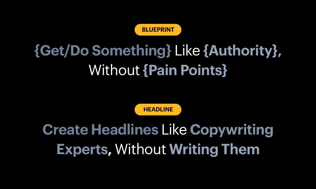
Headlime →
Get access to high converting headlines. Headlime generates hundreds of headlines for you, simply by answering a few questions.
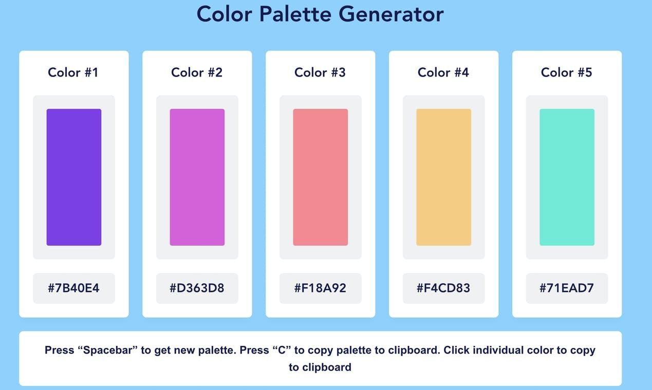
Color Palette Generator →
This is a simple to use color palette generator that generates a new color palette by tapping your space bar. You can save the generated palette to the clipboard or you can save to clipboard just an individual color.
Goods & Gadgets

Sony WF-SP800N →
The WF-SP800N truly wireless sports headphones combine long battery life, resistance to water and sweat, and deep bass sound with digital noise cancelling. So when the going gets tough, they won’t let you down.

Matador SEG42 Travel Pack →
The Matador SEG42 Travel Pack Organized Backpack is everything a traveler needs. It has a 42-liter capacity, allowing you to easily store your essentials for a long getaway. Most importantly, this organized backpack features multiple compartments to keep your items separate.
Useful Resource
Designmodo →
Designmodo offers timesaving tools for designers, developers, marketers and business owners. In addition to design tips and advice, we offer beautifully-designed websites and email builders to speed up your project launches and maintain a business online.
Mental Wealth
➢ Using mental models for better UX design – Want to get on the same page as your users? Then you need to have their mental models down. This post looks at the best tips and examples to get you started The key to great user experience? Understanding how your users think – it’s as simple as that. The technical term for how people think about any concept or process is known as a mental model. We could say that mental models are one of the main pieces in the user experience jigsaw puzzle that UI-UX designers face on a regular basis. User testing and research establish who your users are and what tasks they want to achieve. Discovering their mental models is about finding out how you can help them achieve those tasks. In this post, we’re going to look at how we can apply mental model theory to UI design. We’ll also take a look at some techniques for how we can match our users’ mental models, as well as some classic examples.
➢ Why Sleep Deprivation Kills – Going without sleep for too long kills animals but scientists haven’t known why. Newly published work suggests that the answer lies in an unexpected part of the body. Inside a series of tubes in a bright, warm room at Harvard Medical School, hundreds of fruit flies are staying up late. It has been days since any of them have slept: The constant vibrations that shake their homes preclude rest, cling as they might to the caps of the tubes for respite. Not too far away in their own tubes live other sleepless flies, animated with the calm persistence of those consigned to eternal day. A genetic tweak to certain neurons in their brains keeps them awake for as long as they live.
➢ The design systems between us – A few months back, I wrote about how early design systems advocacy promised that design systems would improve the consistency of our products, and how that promise never really materialized. Lately, I’ve been thinking about another early piece of design systems advocacy: namely, that design systems would introduce new, more collaborative ways of working.
➢ How to Recover After Burnout – Burnout, unfortunately, is everywhere. If you haven’t experienced it personally, you probably know someone who has self-diagnosed. Defined by the World Health Organization as a syndrome “conceptualized as resulted from chronic workplace stress,” it causes exhaustion, “feelings of negativism or cynicism,” and reduced efficacy. That’s a big umbrella, and the condition has become something of a catch-all for chronic, modern-day stress.
Typeface of the Week
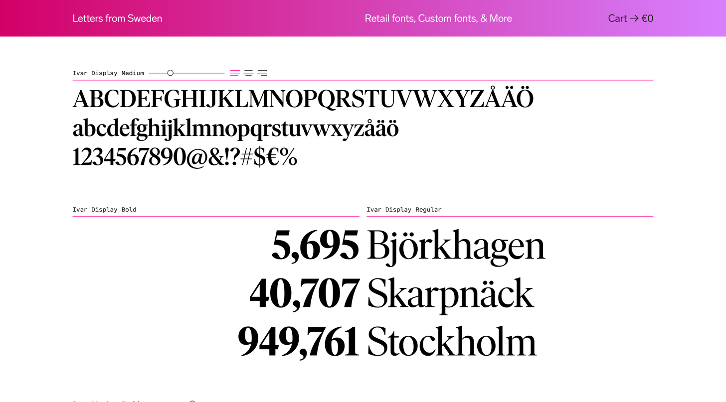
Ivar is a serif typeface family designed by Göran Söderström and published through Letters from Sweden in 2017. The design began as a serif companion to the foundry’s sans-serif Siri family but deviated significantly from there. Ivar is available in three distinct optical sizes—Ivar Text, Ivar Headline and Ivar Display—with each optical size available in four weights with corresponding italics. There is also a chunkier version, Ivar Nostalgi, which was influenced by the high-contrast phototypesetting faces popular during the 1970s. A rounded version, Ivar Soft, is available as well.
Twitter thoughts
You can have an edit button when everyone wears a mask
— Twitter (@Twitter) July 2, 2020
Till next time! 👋
Support: You have a friend who is looking for inspiration, news about design, and useful tools and apps? Forward this newsletter to a friend or simply share this issue and show some support. You can also show some love by simply clicking the button down below and keep this newsletter a sustainable side-project by buying me a coffee. ☕️ 🥰


Discussion