How the calendar became the all-in-one productivity app

Suddenly we went from calendar apps that should simplify our lives to managing meetings, events, todos, and even emails in the same app. But why?

Time management has become one of the most crucial aspects of our lives. The digital age we are living in has produced multiple startups that have identified a market opportunity in building apps to manage time, meetings, and events. However, we are experiencing a paradox in this space. Loads of apps that have launched over the course of the last couple of months and years, have claimed to simplify our lives, helping us getting back control of our time, enhance our productivity, and increase our efficiency. However, it feels like many of these apps have fallen short of their promises, especially when it comes to simplifying our lives. As a result, users get frustrated and overwhelmed with cluttered interfaces and complicated features. Suddenly, the calendar became the all-in-one productivity app, not only displaying our meetings and events, but also our todos, notes, and even emails, yes, emails.
From Simplicity to Overload
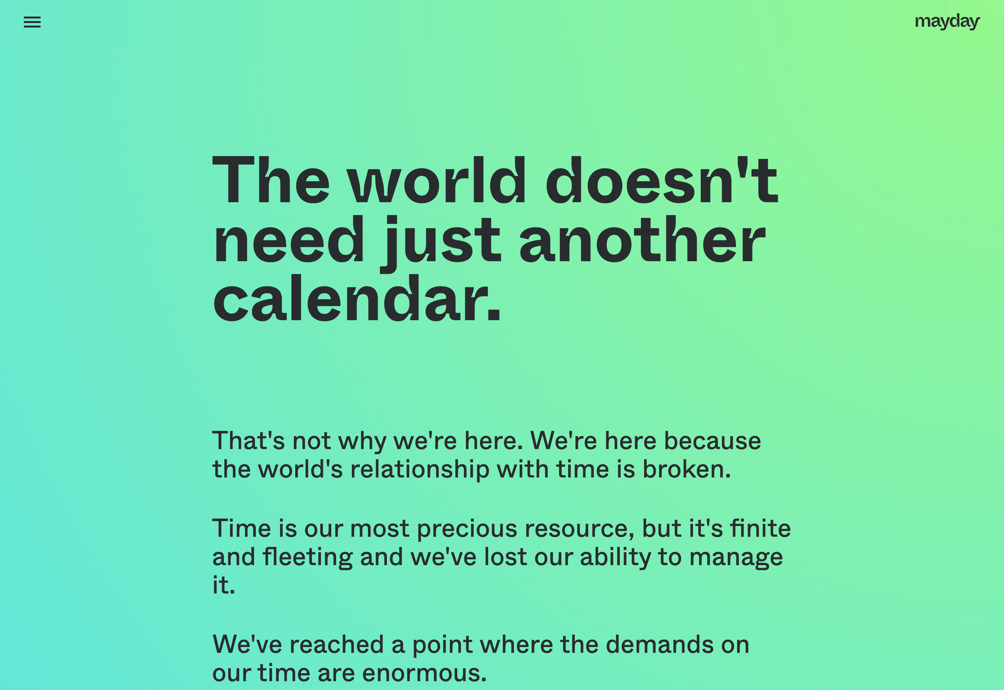
The proliferation of startups building calendar apps can be attributed to the increasing need for effective time management tools in our fast-paced world. As if the world and the life itself would not be already fast-paced enough, the tools we use to manage our time, our productivity, our lives need to be faster than ever, we need to integrate everything with anything. Instead of providing a calm, simple, and minimal space to manage our most valuable asset, our time, we received tools like TimeOS, which claims to be the most versatile AI that automates meetings, integrates with Google Meet, Zoom, Teams, and Slack to capture meeting notes and efficiently organize them in your favorite knowledge systems, or mayday which rightfully discovered that the world does not need just another calendar app (as they state on their ‘about’ page) and therefore decided to build an all-in-one calendar, task manager, and scheduling assistant, or Ready, which launched in 2022 with the idea to turn and transform calendar events into collaborative meeting spaces designed to create the perfect meeting in seconds, and recently shut down.
The list goes on. The calendar app market has became one of the most competitive ones out there. And despite a rising demand for simplicity and lightweight apps, particularly in the realm of calendar applications, and despite the initial intent to simplify time management, many of these apps have become bloated with an array of features. This bloating can be attributed to the competitive nature of the app market, where startups feel compelled to differentiate their products by adding more functionalities. However, this often results in apps that are complex and difficult to navigate, detracting from the user experience and the original purpose of the app. Users are seeking tools that are easy to use and uncluttered, allowing them to manage their time without the distraction of unnecessary features. This preference for simplicity is not just about aesthetics; it also impacts productivity. A simple, intuitive app can reduce the time spent on managing the tool itself, freeing up more time for the tasks at hand. Startups in the calendar app space face a significant challenge: balancing the complexity of features with the demand for simplicity. While features can enhance the functionality of an app, they can also make it more complicated and less user-friendly. Finding the right balance is crucial for success in this market.
A Beautifully Designed Productivity App, But Not For Everyone
While Calendar and Todos already go hand in hand for quite some time, Calendar, Todos, and Emails is a new collaboration Amie recently introduced as part of their official launch. Amie has been one of the most anticipated calendar apps, well, I should use the term productivity app there, since that has always been Amie’s goal, creating and building the most joyful productivity app. Although I used Amie quite extensively over the last couple of months, its official launch gave me the feeling that it is not really the calendar I have been seeking for. Design-wise it definitely is, but I do not want to spend more time in my calendar, in fact I should be as less time as possible in my calendar, since most of my available time should be reserved for focused work, and the rest should be free-time to spend on things that bring me joy. I do not want to get reminded about all the meetings that get my calendar crowded whenever I check my emails. The same applies to my todo list. I keep them in a separated place, so I do not get reminded of them all the time, but when I need reminders I actively set them, when I get back to my todo list, I do it with the intent of getting things done, but most of the time I use it to just keep track of any ideas or things that come to my mind, therefore it would probably stress me out when I get confronted with that kind of information every single time I am opening up my calendar.
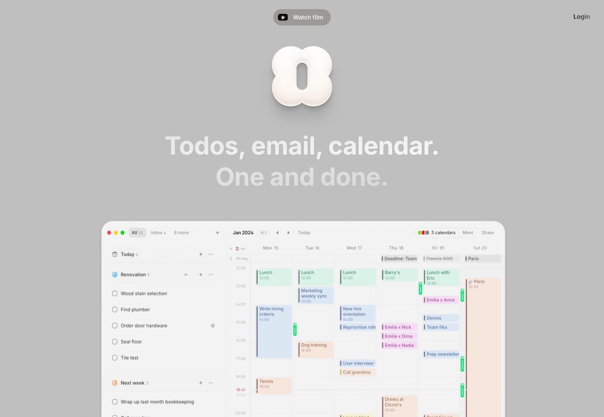
Amie does give you the option to not use their todo feature at all, and you can also hide away the left sidebar displaying them, but the fact that they are visible by default, and I need to actively hide them gives me the feeling that they are seeking for different kind of users, which is legitimate and fine. I still think Amie has one of the best teams out there, seeing what they have built over the course of the last two years is remarkable. Amie set an incredible high standard for beautifully-designed software, and I wish more apps would follow the same approach, since if you would like to build joyful software, the design needs to reflect that.
During its beta phase, Amie has been this beautiful and calm space to simply see my upcoming meetings and events. Over time, todos became a much higher focus, and integrations too. Do not get me wrong, there has definitely been a reason why the team at Amie decided to integrate with Spotify to display the music you have been listening to throughout your days, or with Apple Health to display your sleep cycles, as well as workouts and heart rates while viewing your… calendar, but personally I have no idea why I should display the music I am listening to, or my sleep cycle, or my workouts in my calendar. And simply the fact that those kind of integrations are there, give me the feeling that the app became bloated. Fast-forward to today, and Amie does not only display your meetings, events, todos, the music you listened to, the workouts you did, your heart rate throughout your days, you can now also read, answer, and schedule emails, right within the same app. They even state that emails are closer than ever to your todos and calendar. My urge to detach those fields from each other could not be any stronger.
Again, I appreciate the whole Amie team, they build and design beautiful software, they have without a doubt a powerful productivity app that loads of people enjoy using (the fact that no matter what they are shipping or announcing they always go viral throughout social media is a clear indicator for that), but this idea of taking the calendar, the digital space that once was reserved for our most valuable asset, and transform it into an all-in-one productivity app is simply not for me.
The Dilemma of Native Solutions
Does that mean that people like me have to stick with the native solutions that for example Apple is offering? What happened to the initial quest of building calendar apps that help us simplifying our lives, getting back control of our time, enhancing our productivity, and increasing our efficiency? Is there a way to find a calendar app that truly focuses on simplicity and efficiency without becoming overloaded with unnecessary features? It seems like many calendar apps have lost sight of their original purpose and have become cluttered with integrations and excessive functionality. People like myself who desire a streamlined and focused approach to time management might wonder if there are any alternatives to the native solutions provided by companies like Apple.
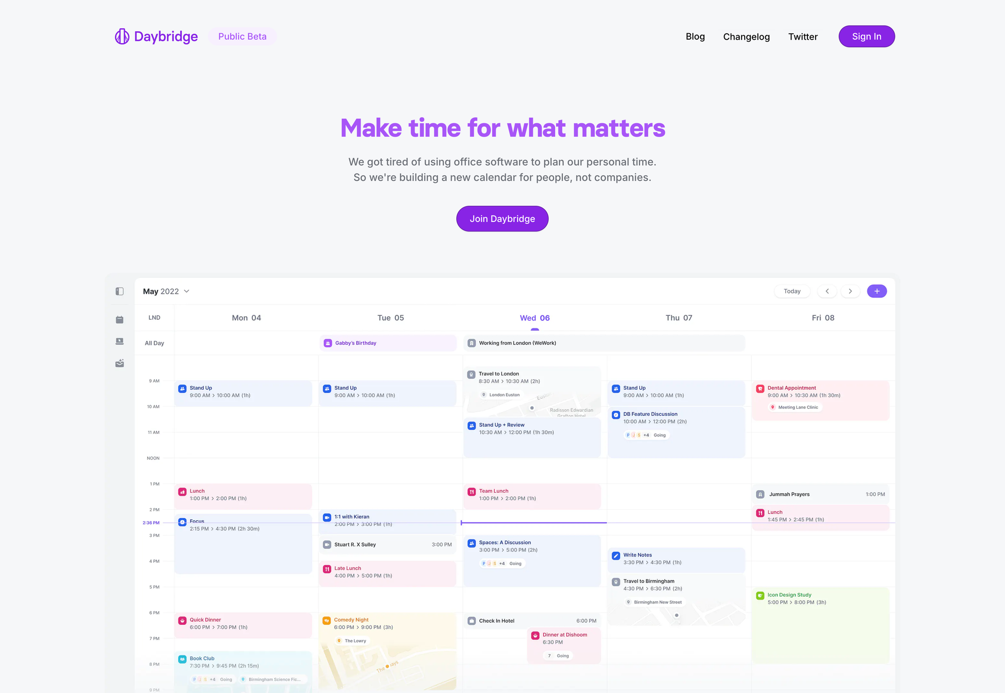
Apple’s native calendar app is great, but there is something special about using beautifully designed software, and if somebody asks me to think about a beautifully designed calendar app, it takes some time until Apple Calendar comes to my mind. Now here is the thing: do I need to take bloat and noice within an app as a compromise, just because I am seeking for little additional functionality and a beautiful interface when looking for a calendar app? Let me tell you, there are two calendar apps which are offering an incredibly beautiful interface, simplicity, yet powerful features that add this additional functionality that people might be missing from native calendar apps. Those two apps are Daybridge and Rise. Daybridge got founded in 2020 and has been in beta since then (Kieran McHugh, founder and CEO, recently announced that they will officially launch in 2024 though). I have been closely following the development of Daybridge ever since then, but just recently I made the switch back to it and I could not been happier with that decision.
Seeking Simplicity and Efficiency
Daybridge explicitly has been built to plan your personal time, and its goal is to be the calendar for people instead of companies. And wow, they delivered. From all the different calendar apps I have used and tested so far, Daybridge offers the best combination of being simple, beautifully designed, and having this slight advantage compared to native calendar apps. So far, it brings me the most joyful experience. The interface is super simple, I love its layout functions which I can use to either only show my booked time, or to mute my work time and focus on my free and focus time. If you add the location to an event, a card preview will get displayed right within the event element, which is simply a beautiful touch. There is no bloat, no noise, no obtrusive UI elements, it just works, at least for me.
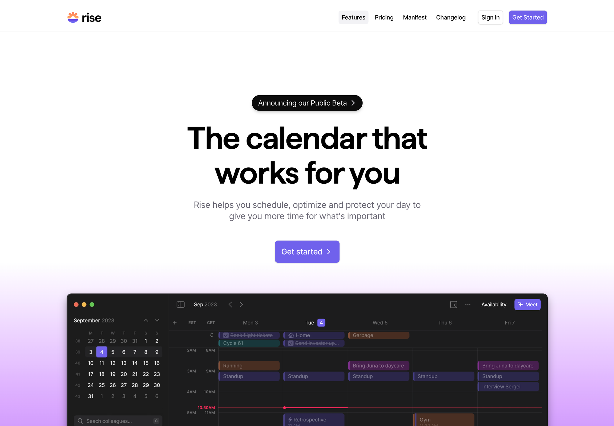
The second app is Rise, which I discovered recently when they announced their public beta. Compared to Daybridge, Rise might have a bit more of a focus on the work aspect of a calendar app, as its core features help you schedule and optimize your day. It offers smart scheduling links, cross-calendar blocking, automatically improves focus time and resolve event conflicts, and optimizes meetings in one click. While I love the personal aspect of Daybridge, Rise also feels less busy, less noisy, and less bloated while having the work and professional focus, compared to all the other calendar apps out there. They want to help you going from overwhelmed to electrified every single day, and they set themselves the goal to build the app that helps you, and your team (and there is the hint that they might become the office software Daybridge explicitly avoids to become) to have more time for what is truly important.
You see that there are still apps that truly focus on simplifying our lives, preserving our most valuable asset, and make time for the important things, which is not always work and being productive. If you are on the hunt for a new calendar app, you get hit by a wall of choices, Amie, Notion Calendar, Morgen*, Hey Calendar, Routine, Vimcal, and loads more, all with the focus of making us more efficient, get things done, integrate with loads of other tools, manage our todos, notes, and projects, and ultimately turn our calendar, which should be this calm and simple space, into a noisy one that overwhelms you every time you take a look at it. Suddenly, the calendar app became the all-in-one productivity app. The startup founders who build those kind of apps are so busy that they felt the need to make their calendar as busy as they are, instead of rethinking their time management in general.
Thankfully, there are apps like Daybridge who focus on building a calendar app for people, and not companies, a simple but beautiful space to manage our personal time, as this should always be the focus. In a world where many calendar apps have become overwhelmed with unnecessary features and integrations, it's refreshing to find apps like Daybridge and Rise that prioritize simplicity and efficiency. Daybridge, with its clean and intuitive interface, offers a joyful and focused experience for personal time management. On the other hand, Rise caters more to the work aspect of calendar apps, helping users optimize their day and prioritize what truly matters. These apps serve as reminders that calendars should be calm and simple spaces, not overloaded with noise and distractions.
Let us keep building simple, easy, intuitive software, even for non-technical users.
Till next time! 👋
Support: Do you have a friend who is looking for inspiration, news about design, and useful tools and apps? Forward this newsletter to a friend or simply share this issue and show some support. You can also show some love by simply clicking the button down below and keep this newsletter a sustainable side-project by buying me a coffee. ☕️ 🥰

Discussion