How to take Design Feedback Strategically
In this week's issue of Creativerly: Summarize articles automagically, writing app and task manager combined, the fallacy of easy, and a lot more.

You are reading Creativerly, the weekly digest about creativity and productivity-boosting tools and resources, combined with useful insight, articles, and learnings from the fields of design and tech. The newsletter built for the creative community.
Hey and welcome to issue 39 👋
Last week, I became aware of an app from a taxi company operating in Graz. I was shocked when I saw it in the Google Play Store. Apart from the design (I'll come back to that soon), I immediately noticed that the company has simply taken screenshots of the App as App Store Screens. Do not get me wrong, as an independent developer, who just wants to bring his app into the App Store, it is legitimate not to spend a lot of time and money on the design of the App Store Screens. But in this case, it is a big taxi company. And in 2019, this company decided to launch an app for its customers. The app itself, however, looks like it's one of the first apps from 2007.
In such situations, I keep asking myself how it is possible that in 2019 there are still be companies that have not understood the appreciation, function, and effectiveness of design. I appreciate the fact that they decided to launch an app to make it more convenient to book a taxi. But when you start the app up the UX is just horrible. It's just inexplicable to me how you can develop the awareness that you are launching an app and at the same time taking absolutely no consideration for UI and UX design.
In some ways, it is also our job as designers to raise awareness that design, if used and executed properly, can deliver significant business benefits. If you see an app or a design that has clearly gone wrong, just write feedback. Not only does it train your feedback qualities, it also creates awareness. Whether the recipient of the feedback now accepts this is another matter. But you at least try it. Analyzing design and showing mistakes is a skill that you can train.
If you have recommendations or feedback, drop me an email or a tweet. For now, enjoy the newsletter! 🥰
Apps, Software, Tools
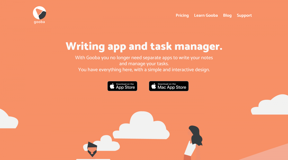
Gooba →
With Gooba you no longer need separate apps to write your notesand manage your tasks.Write a document and set a reminder to remind you when to send it. With Gooba you can do both in one app.
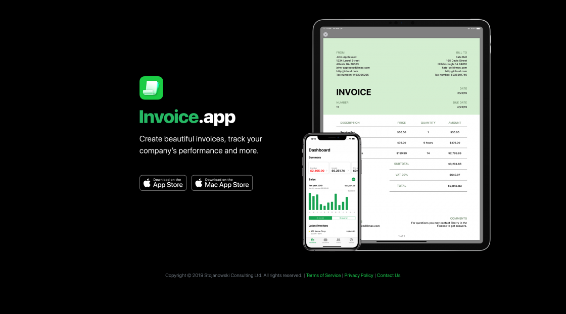
Invoice App →
Invoice.app is a simple, easy to use and powerful invoicing app. It has been carefully designed and developed to offer the best user experience. It’s perfect for freelancers, contractors and small business owners. Available on iOS, iPadOS and macOS.
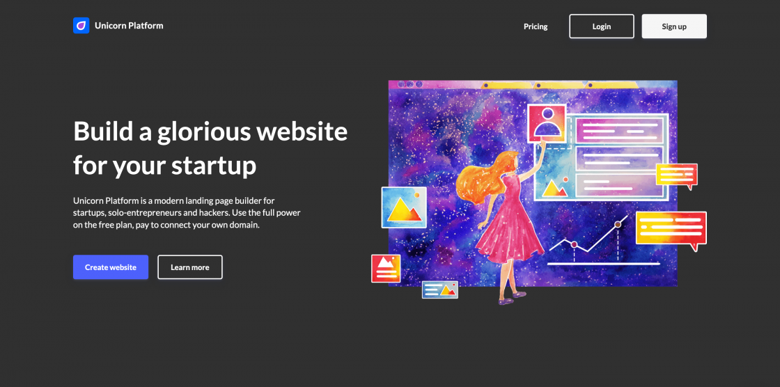
Unicorn Platform →
Use Unicorn Platform to create a high-end landing page for your startup. No coding and design skills required to create a stunning website for a SaaS, mobile application, desktop software or any other project.
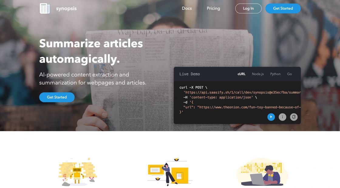
Synopsis →
Summarize articles automagically. AI-powered content extraction and summarization for webpages and articles. Building on top of serverless functions means you'll only pay for the API calls you actually use.
Goods & Gadgets

Powerup 4.0 →
The best POWERUP yet with an onboard flight computer, flight telemetry, and awesome night flight. Thanks to a new onboard flight computer, autopilot assist, 2 new sensors, and a design so robust, you can fly just anything with Powerup 4.0.

Bowers & Wilkins PX7 →
Wherever you go, experience music at its highest level. No matter where you are, powerful drivers and adaptive noise canceling put you in the center of the music.
Useful Resource
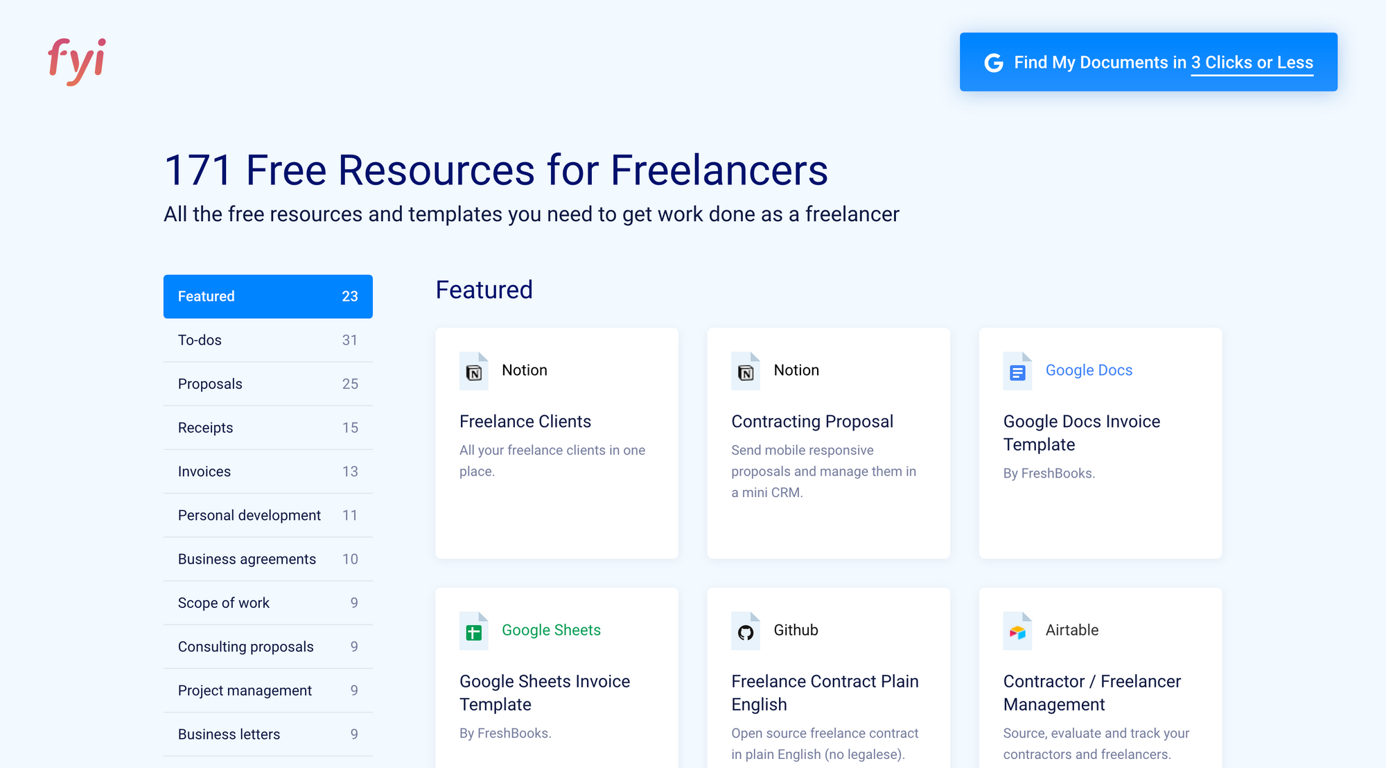
Freelancer Resource List →
An up-to-date list of 171+ free freelancer templates and resources covering 24 categories including proposals, contracts, invoices, to-do lists, & personal development. You’ll find resources from your favorite tools including G Suite, Notion, Trello, & more.
Mental Wealth
➢ Success comes to those who understand their customers – “Knowing what your customers care about, the targets they are trying to meet and the problems they are trying to solve is foundational knowledge for every member of your team. Understanding your customers better should be a core activity of your business.So, what do we need to know to get a better understanding of our customers?”
➢ Maximalist Design and the Problem with Minimalism – “Many people think of the Japanese when they think of minimalism. Clean lines, zen simplicity, the careful, deliberate brushstrokes of a master. What people forget is that Japan is also the fount of arguably the most outrageous maximalist design in the world. For every Marie Kondo, there’s a Yayoi Kusama. For every zen garden, there’s a Hachikō Square.”
➢ Stay Cool: How to Take Design Feedback Strategically – “Design is part art and part science. Designers apply their skills and knowledge to solve specific problems and support a client’s goals as well as those of the product’s end-users. To this end, at each stage of a project, designers should solicit (and welcome!) thoughtful design critiques that will help them arrive at an optimal design solution. Being receptive to feedback, however, is its own challenge. Personal thought processes and creativity are up for critique by fellow designers as well as laymen. However, to be effective, designers need to learn not to take any reasonable design critique personally. For it to be useful, they must be able to interpret, assess, and apply it strategically to their process.”
➢ The fallacy of easy – “The first question I ask when meeting other designers is how they would define design. Some have asserted that there are no wrong answers to this question. They are wrong.”
Essential Reading
➢ Educated by Tara Westover - Born to survivalists in the mountains of Idaho, Tara Westover was seventeen the first time she set foot in a classroom. Her family was so isolated from mainstream society that there was no one to ensure the children received an education and no one to intervene when one of Tara’s older brothers became violent. When another brother got himself into college, Tara decided to try a new kind of life. Her quest for knowledge transformed her, taking her over oceans and across continents, to Harvard and to Cambridge University. Only then would she wonder if she’d traveled too far if there was still a way home.
Typeface of the week
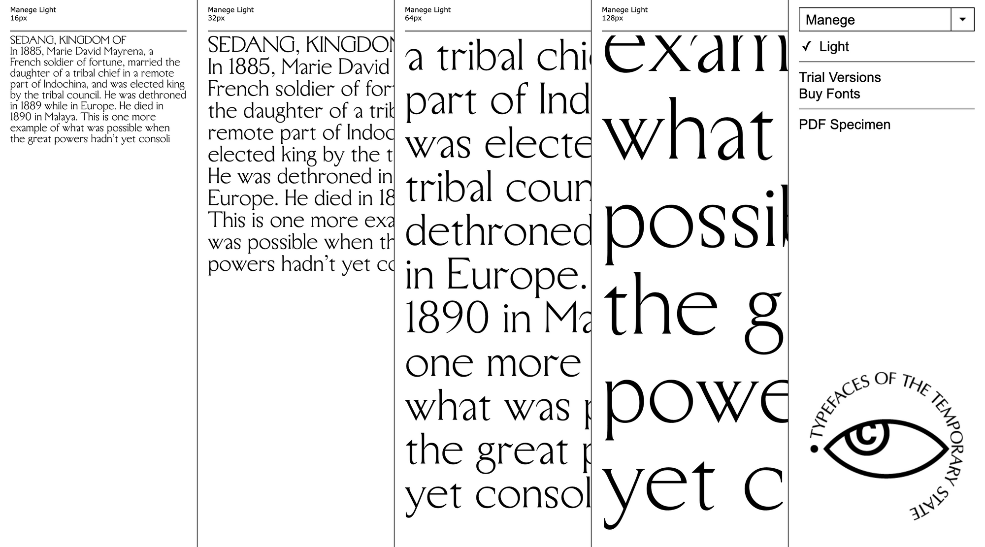
Manege is a serif typeface designed by Roman Gornitsky and published through Russian foundry The Temporary State in 2017. It was created for the 200-year celebration of the Manege Central Exhibition Hall in Moscow. The design attempts to combine “monumentality with clumsiness.” The family is available in a single light weight without italics.
Twitter thoughts
Careers are very long. People may get lucky early, but it is amazing to observe how the passage of time eventually favors the persistent and focused. I have now seen this play out so many times.
— Matt Turck (@mattturck) November 3, 2019
Till next time! 👋
Support: You have a friend who is looking for inspiration, news about design, and useful tools and apps? Forward this newsletter to a friend or simply share this issue and show some support. You can also show some love by simply clicking the button down below and keep this newsletter a sustainable side-project by buying me a coffee. ☕️ 🥰
Disclaimer: My posts may contain affiliate links. If you buy something through one of those links you won't pay a penny more, but I'll get a small commission, which supports this blog and also my side-projects. So consider buying something through my links. Thank you!


Discussion