Make your app happen & The Art of Being Alone
In this week's issue of Creativerly: Get smarter every day, let's transform teamwork, Instagram is dead, and a lot more.
My name is Philipp* and you are reading* Creativerly, the weekly digest about creativity and productivity-boosting tools and resources, combined with useful insights, articles, and findings from the fields of design and tech. The newsletter built for the creative community.
Hey and welcome to Creativerly 179 👋
As mentioned in one of my previous newsletter issues, I have received access to Arc, a revolutionising browser from the team at the Browser Company. I shared my early impression in a Twitter Thread I posted recently. I want to take this opportunity and also share some more insights with you.
Browsers became incredible powerful over the last couple of years. You are able to design, draw, write, create animations, illustrations, 3D objects, manage complex projects and processes, and a do lot more all within your browser. There are a lot of opportunities. Although Browsers give us all these opportunities, they did not change that much when it comes to the interface and the way we interact with the internet. There are indeed some browser like Stack, SigmaOS, Beam or Sidekick which indeed took a different path than other browsers, and I am excited about that, since we need to turn the browser into a creative space with creative opportunities to create, build on, and interact with the internet.
Arc not only is a revolution within the fields of browsers because of its beautiful interface, it also has some incredible features that boost my productivity, makes switching between projects easy, and gives me the creative freedom I was always looking for when I tested „modern“ browsers. But what makes Arc different to other browsers? First of all, Arc features a high standard for craft, design, and detail when it comes to the interface and user experience. There is something magical about using beautifully designed software, and Arc is the perfect example for it. It started with the onboarding experience and continued throughout the whole app.
Whenever people saw my browser, they were amazed by the number of tabs I have constantly open. I am not a tab hoarder. I just like to work across multiple tabs and keep information right at my fingertips instead of saving it within a bookmarking tool just so I forget about it. Most of nowadays browser do not let me use a workflow like that, because using a high number of open tabs or even windows to manage and structure different projects you are constantly working on, not only slow down your browser experience but your complete working machine. There are indeed browser extensions that aim to give you the chance to work across loads of tabs, but none of them clicked for me. Within Arc, I can create dedicated workspaces for different use cases and projects.
On top of that, I pinned my most used sites and organised them within folders, so I always know where my tabs are. With Shortcuts I am able to navigate through my spaces and my open tabs, create new folders, set up split views, and more. Arc even lets you create nested folders, which is a huge plus when it comes to structuring and organising your work. Arc does indeed take up some space on your RAM (obviously) but it is nothing comparable to Firefox with loads of tabs open. Arc delivers a constant performance because tabs you do not pin will get archived after 24 hours so you can always be sure to work with speed and performance within your browser.
One of my most favourite features of Arc is Split View. This allows me to open multiple tabs side-by-side. It has been pure joy for me to use this feature for my writing process over the last couple of days. With a recent feature, Arc reworked the Split View treating it as separated tabs, which stays open when you switch to a different tab or workspace.
Just after a couple of hours of usage, the tabs in the sidebar of Arc already felt like a no-brainer. The more time I spent with Arc, the more I realise how powerful it is, and how desperate I was in the need of a new browser experience.
So far, it has been pure joy to use Arc, and I looking forward to what they have planned in the future. Maybe they will also reinvent and revolutionise mobile browsing. We will see!
Get smarter every day.
Refind →
Every day Refind picks 7 links from around the web for you, tailored to your interests. Loved by 50k+ curious minds.
This is a sponsored message or an affiliate link to support Creativerly. If you are interested in putting your tool, product, or resource in front of over 1700 creative minds, consider advertising in Creativerly and book a sponsor or classified ad spot. Find all the important information at creativerly.com/advertise.
Apps, Software, Tools
Mural →
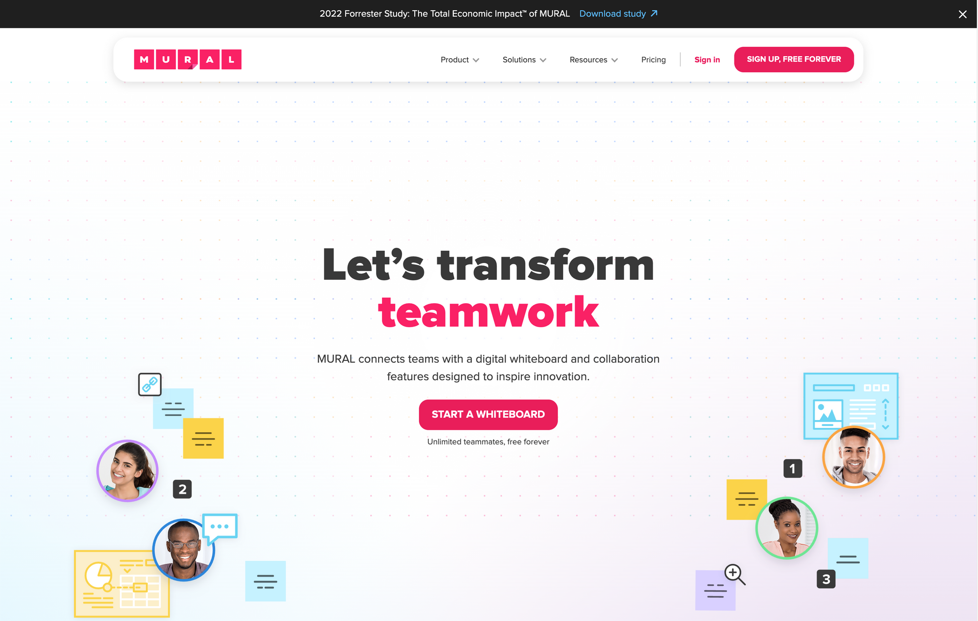
It is no longer a secret, that visual-first tools are getting more and more popular. The aspect of being able to create within an infinite canvas and give your creativity the freedom it deserves is of incredible value. Just a couple months ago, I was not attracted to visual-based tools, fast forward to today and I incorporated tools like Scrintal, Napkin*, and Muse within my workflow. Mural is another beautiful tool that aims to connect teams with a digital whiteboard and collaboration features to spark ideas and inspire innovations.
Mural is centered around a digital whiteboard collaboration space, where teams can work together in real-time or asynchronously. No matter if you want to brainstorm ideas, work on strategy and planning, doing research or analysis, Mural is a powerful tool offering guided methods, transformation expertise, and beautiful templates to kickstart innovation. Within Mural you will find a variety of flexible features to help your team work together and visualize ideas. You can effortlessly add thoughts, ideas, and feedback for further action to your whiteboards. To build diagrams to map out complex workflows, Mural has a set of shapes and connectors. Icons support you on your journey of building a visual story. Mural wouldn‘t be the powerful visual-first tool if it wouldn‘t allow you to drag and drop visuals onto the whiteboard or give you the opportunity to maximize creativity with freehand sketching and writing.
Teams across different departments like consulting, product, or technology use Mural to boost their creativity and collaborate within a creative infinite space. Make your meetings stand out by giving the participants the possibility to engage on a digital whiteboard, bringing your remote team members together. Mural is available for macOS, Windows, iOS, Android, but also for Touchscreen displays powered by the Surface Hub. You can use it for free for up to three murals and unlimited members. The free plan is a great opportunity to get to learn about the powers of Mural since you get access to all visual collaboration and facilitation features and to the full template library. Once you want to collaborate frequently with your team throughout unlimited murals, you can sign up to the Team+ Plan which will cost you $9.99 per member per month. On top of unlimited murals within your workspace, the Team+ plan also gives you privacy controls for rooms and murals, as well as in-app chat and email support.
It is exciting to see how popular visual-first tools became and I am ready to see those tools evolve, integrate with other tools, and giving users access to powerful workflows.
Cloud Outliner 2 →
I stumbled across Cloud Outliner while browsing through the offering of Setapp*, since I was on the hunt for new apps to test and try. Outliner tools are powerful apps to not only quickly capture and iterate on a dedicated thought or idea, they also are capable of organizing your plans and projects in a clear way.
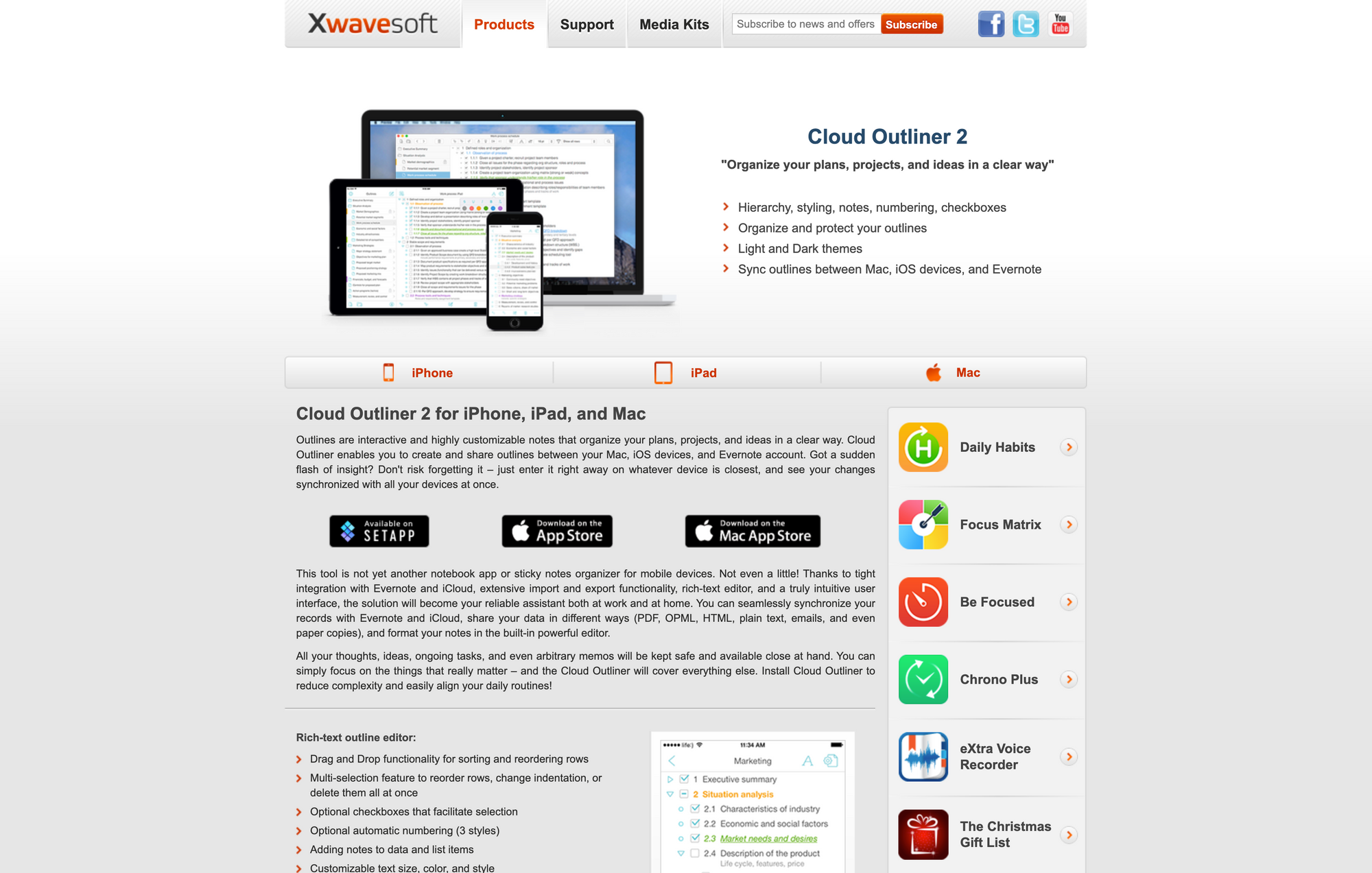
For the longest time, I have been using outliner software (Workflowy) to not only take notes throughout my day, but also to structure all my projects, and even write all my blog posts. The only reason I decided to move to Craft, was the fact that I am attracted to beautiful crafted apps and performance across all the platforms I use is a key-feature for me. Cloud Outliner is available for the Apple ecosystem with apps for iOS, iPadOS, and macOS. The beauty about outliners is the fact that they are interactive and give you the possibility to create highly customisable notes to organise your plans, projects, and ideas in a clear and structured way. Cloud Outliner is not just another note app. Cloud Outliner deeply integrates with iCloud and Evernote, offers extensive import and export functionality, so it will become your reliable assistant both at work and for your personal projects. The integration with Evernote and iCloud lets you sync and share your data in different ways to all your devices.
While Cloud Outliner does not feature the most beautiful crafted and modern user interface, there is no doubt that it is still intuitive and structured. No matter which platform you are using Cloud Outliner on, you will always stay on top of your notes and projects, with a dedicated sidebar or navigation drawer which gives you an overview of all the outlines you have created. Within Cloud Outliner you will always have all your thoughts, ideas, ongoing tasks, and anything else right at your fingertips. You decide on which things you would like to focus, and Cloud Outliner will over everything else. Cloud Outliner's rich-text editor lets you drag and drop elements for sorting and reordering rows. Additionally, you can also multi-select multiple elements to reorder multiple rows, change indentation, or delete them all at once. On top of that, you can customise text size, color and style, highlight important rows, view completed task, filter, and a lot more.
Cloud Outliner is available for $4.99 for iOS and $9.99 for macOS, but you can also grab it if you have a Setapp* subscription.
Aaply →
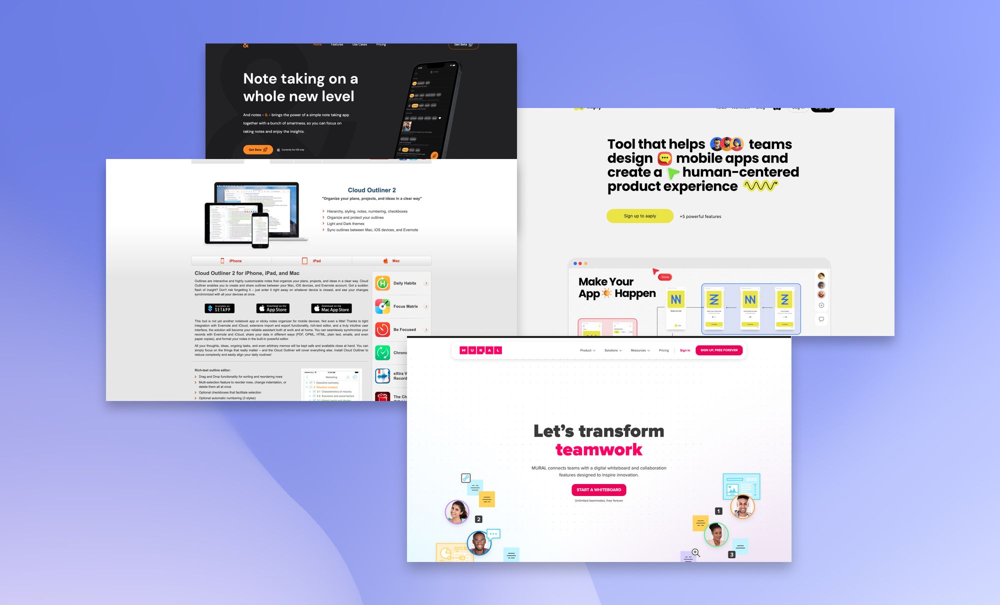
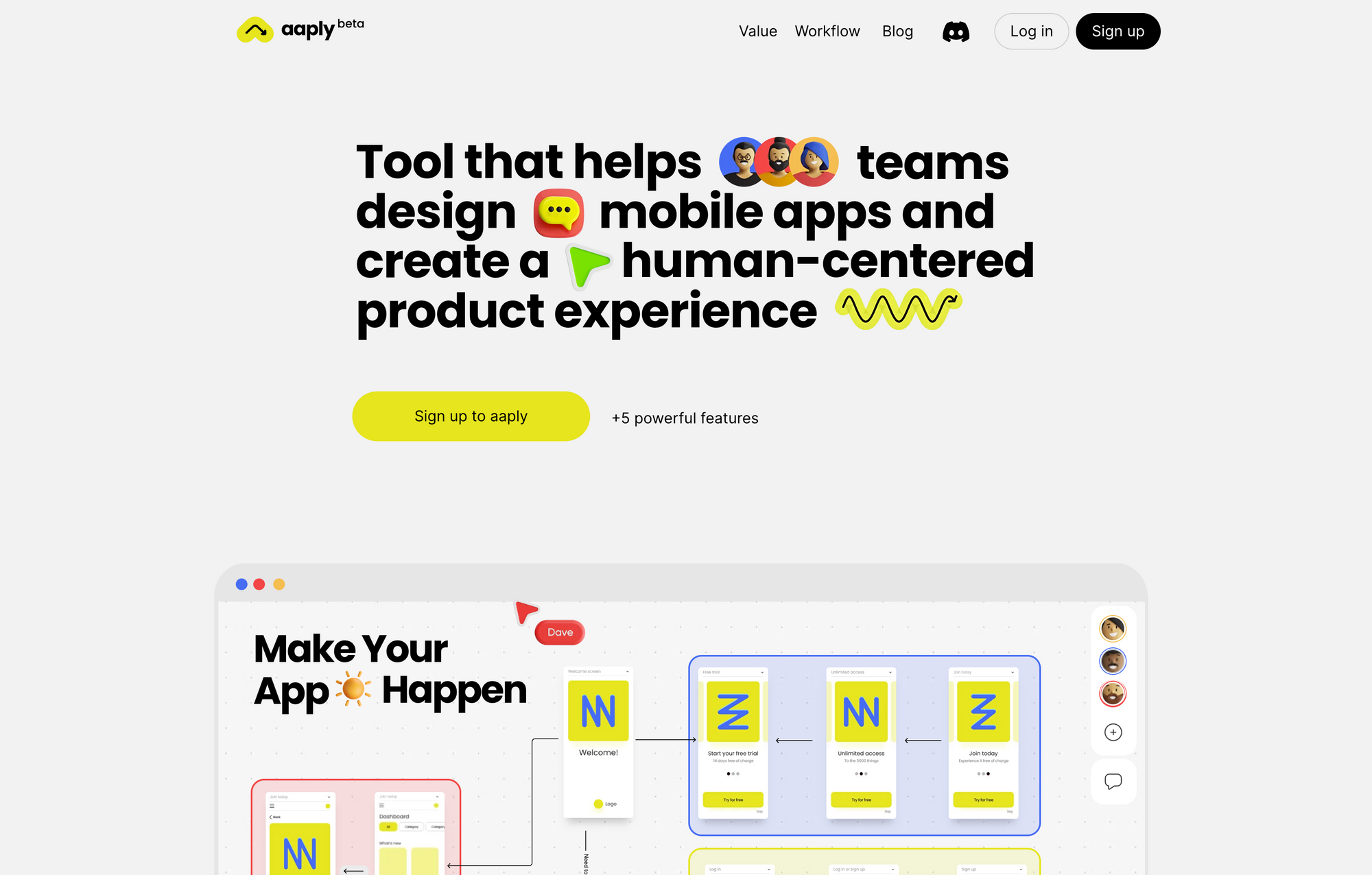
Aaply is an incredible interesting tool that helps you and your team design mobile apps and create a human-centered product experience. Aaply is not a design tool like Figma or Sketch, it reinvents mobile screen wireframing before you start working in Figma.
Designers usually have different workflows when they kicking off a new design project. Some designers directly hop into their preferred design tool and simply start designing and iterating on different ideas. Others like to sit down with pen and paper first to create some rough sketches before deciding which ideas actually will get focussed on within Figma or Sketch. And then there are also designer who like to create wireframes of their first ideas. No matter which process you prefer, we all know the problem of endless design edits. Aaply creates a process that lets you manage low poly wireframes with ease. Within Aaply you can visually plan a mobile app journey from onboarding to check out, and everything in between. Aaply is powered by an infinite canvas to get the whole picture on how to onboard, activate, entertain, ad engage users within your mobile app design.
To boost your iterating phase, Aaply has ready-made templates which you can expand and combine until you get exactly where your mobile strategy is leading you. If you ever experienced the blank page problem, you should give Aaply a try since its design-focused approach for planning, reviewing, and creative predesigning is a great way to prevent you from hitting a wall during the early stages of your design projects. On top of that, Aaply gives you a space to communicate, collaborate, discuss, and coordinate work. Aaply was built for a modern work vision.
Aaply is an incredible tool and I am excited to have discover it.

And Notes →
And Notes - & - is a new note-taking app, currently in beta, and only available for iOS, which is an interesting approach in my opinion to create a note-taking app for a mobile operating system first. & brings the power of a simple note taking app together with a bunch of smartness. It was designed to give you full focus on taking notes and enjoying the insights you get from it.
Core features of & are automated folders which means that based on your tags, & structures your notes into dynamic folders. Additionally, & goes beyond the surface and gives you insights and more information about the notes you take. On top of that, & also features a graph view, but it is calling it tag network, since it visualises the relationship between tags and offering you an interactive view of your notes. &'s automated folder structure is an interesting feature that gives you the chance to forget about structuring all your notes and focus on what matters, which is actually taking and creating the notes. The folders will get created based on the tags you use. This is a natural structure, always up to date and you can use it to browse your notes.
The insights feature within & was designed to let you understand the notes you take and to learn from them. & presents you multiple insights, such as productivity and tag usage. I am not sure how productivity can be measured and what the input is to create such kind of insights.
The tag network within & uses a smart algorithm to find relationships you have created between the note you took. On top of that, it lets you interact with the network to explore and filter your notes. Other than that, & offers synchronisation via its cloud so you can access your notes anywhere once & launches it web app, it offers a hybrid markdown editor, it follows an offline first approach, and more.
You can download and try out & for free. All core features are included, but the Free Plan is limited to 100 notes. If you need unlimited notes, you can sign up to the Unlimited Plan for €2 per month. This plan does not include synchronisation. For that, you need to upgrade to the Everywhere Plan for €3 per month.
Mental Wealth
➢ Instagram is dead – “Okay, I didn’t mean to be so dramatic. Or use a clickbait headline, but in reality, what used to be Instagram is now dead. It was a wonderful gathering place for photographers to showcase their work and build an audience. Not a day goes by when some photographer friend or the other bemoans how Instagram is no longer a place for photography. ”
➢ How to admit you’re wrong – “Julia Strand was confident in her scientific findings when they were published in 2018. Strand’s research showed that when a circular beacon of light was present in a noisy setting, people expended less energy listening to their conversation partner and responded quicker than without the light. The feedback was positive and Strand, an associate professor of psychology at Carleton College in Northfield, Minnesota, had received grant funding to continue her research.”
➢ Why a meaningful life is impossible without suffering – “The writer and philosopher Alan Watts once posed a thought experiment: Suppose you could dream any dream you could imagine, night after night, for as many years as you wanted. Odds are you’d start off by pursuing fun and simple pleasures, like Bill Murray’s character in Groundhog Day. But that would inevitably get old. At some point, you’d start ceding control over your dreams because you’d desire challenge, chaos, and, eventually, suffering. In the end, Watts said, “You would dream the dream of living the life that you are actually living today.” Watts’ thought experiment raises a question about how people derive meaning: Is it possible to live a meaningful life without suffering? To psychologist Paul Bloom, suffering and meaning are often inextricably linked.”
➢ The Art of Being Alone – “At a moment in time when many people are facing unprecedented amounts of time alone, it’s a good idea for us to pause and consider what it takes to turn difficult loneliness into enriching solitude. We are social creatures, and a sustained lack of satisfying relationships carries heavy costs for our mental and physical health. But when we are forced to spend more time alone than we might wish, there are ways we can compensate and find a fruitful sense of connection and fulfillment. One way to achieve this is by using our loneliness as a springboard for creativity.”
Do not miss out on this …
- Join 50k+ smart people on Refind and get 7 new links every day that make you smarter, tailored to your interests, curated from 10k+ sources.
- Think tasks, not apps. Setapp* is you one-stop subscription to solving every task on Mac and iPhone.
- Fathom is cookie-free, GDPR compliant, privacy-first website analytics software. Get $10 off your first invoice and a 7-day free trial when you use this link*.
These are paid promotions or affiliate links to support Creativerly. If you are interested in putting your tool, product, or resource in front of over 1800 creative minds, consider advertising in Creativerly and book a sponsor or classified ad spot. Find all the important information at creativerly.com/advertise.
From the archive
On August 8th 2021 I wrote about ...

Appendix
➢ ICYMI
Creativerly’s interview with Elizabeth Butler (creator and founder of Calmer Notes*) is out now. If you want to get insights into how a productivity and personal knowledge management enthusiast is structuring and organising notes, managing projects, building in public, and if you want to read about thoughts about the PKM space in general, then I encourage you to check out Creativerly’s interview with Elizabeth Butler. Head over to creativerly.com and give it a read.
➢ Quick Bits
- A national data privacy bill is gaining traction, but not everyone is yet on board
- Amazon goes all in on healthcare with $3.9B purchase of One Medical
- Facebook pivots away from news after shoving it in our faces for years
- Twitter data breach exposes contact details for 5.4M accounts; on sale for $30k
- WhatsApp launches chat migration from Android to iOS and vice versa for all users
- Report: Microsoft will return to releasing new Windows versions once every 3 years
- Netflix loses almost a million subscribers
- Homeland Security is tracking US citizens using phone location data
- Elon Musk wants Twitter trial to wait until February 2023
- Amid data concerns, TikTok security officer steps down
Twitter thoughts
“I’m an expert at Figma but still not getting work as a product designer. Not sure what else to do.”
— DANN ツ (@DannPetty) July 19, 2022
Become an expert at design not the tool.
Share or forward this newsletter to your friends, if they are also looking for creativity and productivity-boosting tools and resources. If you need help to discover your next favorite task management, note-taking, or PKM app, Creativerly delivers the insights you need. Creativerly is an indepentend publication and I am writing and maintaining it in my free-time. You can support Creativerly and my work by sharing it with the world, booking an advertising spot, or by buying me a coffee.
Some of the links in my newsletter and my blog posts are affiliate links. Those links are marked by an asterisk. If you buy something through the link, the product will not cost you anything more, but I will receive a small commission which not only supports Creativerly and my work but also helps me to keep this publication a sustainable side-project.


Discussion