Organize your tabs in Spaces & The new line of premium Smartphones from Samsung

In this week's issue of Creativerly: A plugin to implement dark mode to your website, interactive prototyping for the digital products of tomorrow, and a lot more.

You are reading Creativerly, the weekly digest about creativity and productivity-boosting tools and resources, combined with useful insight, articles, and learnings from the fields of design and tech. The newsletter built for the creative community.
Hey and welcome to issue 26 👋
With this issue of the creative abstract I want to introduce a little Button at the end of this newsletter. It says "Buy me a coffee" and it is a super simple and fast way to support this newsletter, so it can stay a sustainable side-project. 😊Also as you have might already seen in the last newsletter, there is a new section called "Tweet of the week". I will also adapt some design changes and try some things out over the next few weeks, so stay tuned.
If you have recommendations or feedback, drop me an email or a tweet. For now, enjoy the newsletter! 🥰
Apps, Software, Tools
Space Browser →
Space organizes your tabs into spaces, which act like smart folders and makes it easy to recall your tabs with the help of the rethought history, where you can travel back in time to restore entire sessions or just that one tab you were searching for.
Blackout →
Blackout is a free WordPress plugin that implements a Dark Mode widget into your website, which allows your users to enable or disable it with a single click. It provides you with an easy to use settings page so you can customize it without coding.
ProtoPie 4.0 →
Interactive prototyping for the digital products of tomorrow with the all-new ProtoPie 4.0. Realistic, customized microinteractions, Reusable interaction components, Seamless import from Sketch, Figma, and Adobe XD, macOS & Windows, iOS & Android.
Pasta →
Remember everything you copy to your clipboard. Pasta is a designer-friendly clipboard manager that is fast and easy to use.
Goods & Gadgets
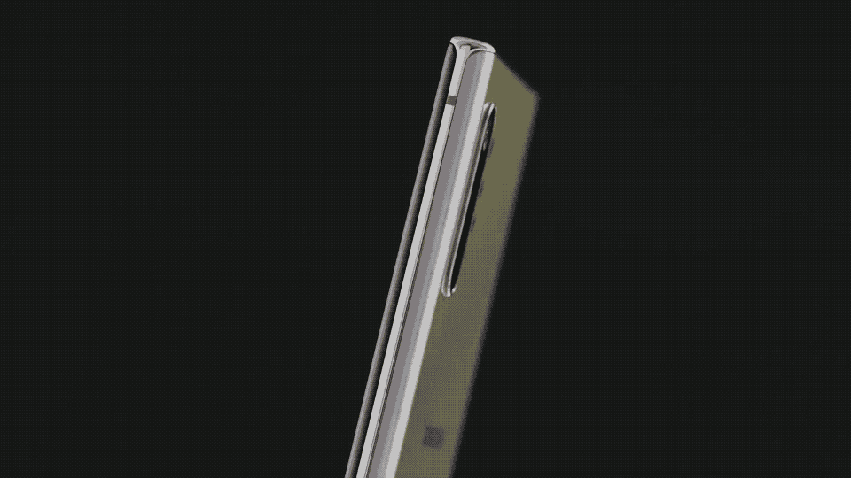
Samsung Galaxy Note 10 →
Galaxy Note10 is a new line of premium smartphones that combines elegant design with powerful performance and productivity tools to help you make the most of every moment.
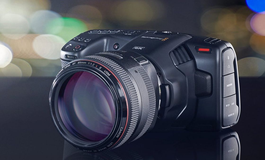
Black Magic Pocket Cinema Camera 6K →
Blackmagic Pocket Cinema Camera is better than a simple video camera because it has professional features allowing you to create the same "look" as Hollywood feature films.
Useful Resource
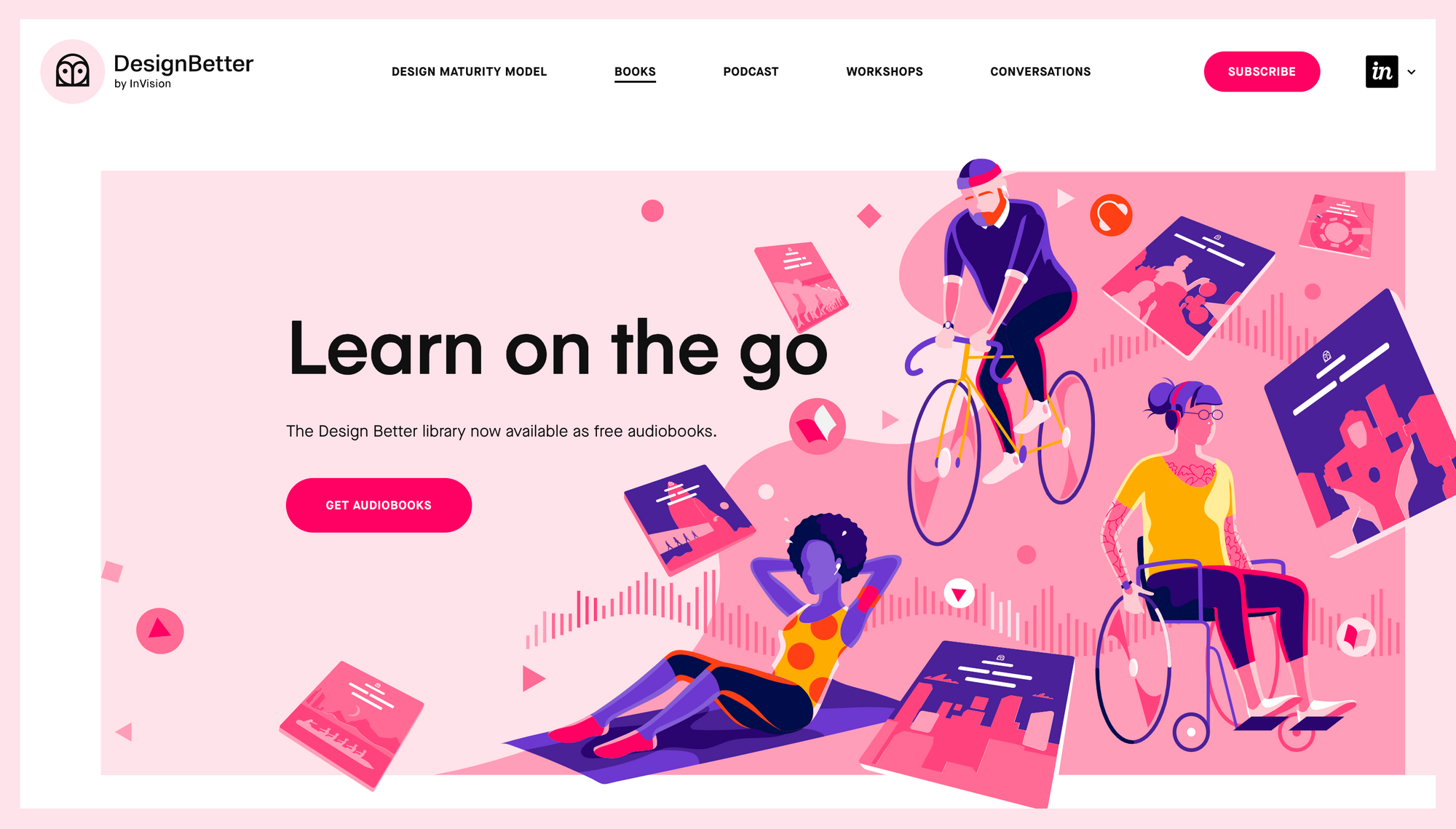
Design Better by InVision →
Learn on the go. The design better library now available as free audiobooks. Best practices for better design. Design Better provides unprecedented access to the insights that power the world's best design teams.
Mental Wealth
➢ Why you should keep your portfolio updated – especially if you have a job – “I recently ran a poll on Twitter asking what people did with their portfolio once they got a job. The results were both surprising and not surprising.”
➢ How to Write a Better Bio – “There's no need to panic when asked for a professional summary. Here's our guide to the tricky-but-crucial bio statement all freelance creatives need.”
➢ Forget the computer — here’s why you should write and design by hand – “J.K. Rowling scribbled down the first 40 names of characters that would appear in Harry Potter in a paper notebook. J.J. Abrams writes his first drafts in a paper notebook. Upon his return to Apple in 1997, Steve Jobs first cut through the existing complexity by drawing a simple chart on whiteboard. Of course, they’re not the only ones…”
➢ Getting to the Heart of Digital Accessibility – “Quick! Think of the word “developer” or “coder” — what’s the first thing that comes to mind? Maybe a whiteish male in his twenties living in a busy metropolis, wearing a nerdy t-shirt and hoodie? Someone a bit like Mark Zuckerberg? Or maybe a younger Bill Gates or Sergey Brin? Any of the dudes from the HBO series Silicon Valley, perhaps? Certainly no one like me.”
Typeface of the week
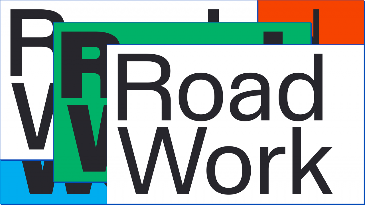
Staff is a sturdy neo-Grotesk sans family designed to be practical and versatile in its use of space.
Staff’s letter-forms are on the whole rooted in the neo-Grotesk tradition but are dotted with some slightly offbeat details like the pointed apex on the M, the enlarged bowl on the a, and the vertically-cut tail on the Q.
Staff has a mechanical and dry look that is conveyed by lines bent in rigid right angles; by terminals cut horizontally at the same height in different letters and in different weights, and crossbars and waists forced into the same vertical position. Furthermore, all the different weights and widths share the same vertical metrics.
Twitter thoughts
Favorite video at the moment #figma pic.twitter.com/lL5VokqyCG
— Nicole Saidy (@nicolesaidy) August 8, 2019
Till next time! 👋
Support: You have a friend who is looking for inspiration, news about design, and useful tools and apps? Forward this newsletter to a friend or simply share this issue and show some support. You can also show some love by simply clicking the button down below and keep this newsletter a sustainable side-project by buying me a coffee. ☕️ 🥰
Disclaimer: My posts may contain affiliate links. If you buy something through one of those links you won't pay a penny more, but I'll get a small commission, which supports this blog and also my side-projects. So consider buying something through my links. Thank you!
Discussion