Save color palettes from beautiful unsplash images & Turn your iPad into a MacBook

In this week's issue of Creativerly: Dramatically compress images, get your focus back, when your design is good enough, and a lot more.

You are reading Creativerly, the weekly digest about creativity and productivity-boosting tools and resources, combined with useful insight, articles, and learnings from the fields of design and tech. The newsletter built for the creative community.
Hey and welcome to issue 35 👋
As already announced in the last issue of this newsletter (you can check it out here if you missed it: The Creative Abstract #34) The Creative Abstract will get a rebrand with a new name and just some slightly content changes. Nevertheless I will focus on delivering quality content to help you to push and boost your creativity and productivity. With the next version of this newsletter I want to introduce to you "Creativerly". You will receive the rebranded newsletter from a new email address, so make sure to check your spam folder next Sunday and add the new email address to your mailing list. More infos on the whole rebrand will drop with issue #36, so stay tuned! 😊
If you have recommendations or feedback, drop me an email or a tweet. For now, enjoy the newsletter! 🥰
Apps, Software, Tools
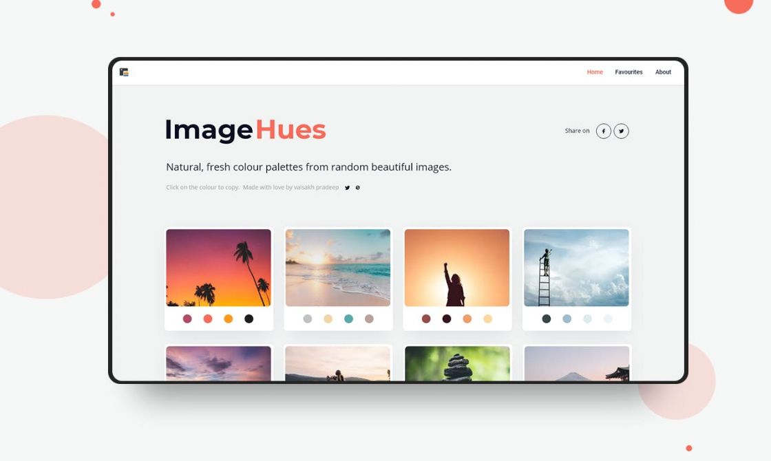
ImageHues →
ImagesHues is a tool for designers and illustrators to pick and save natural color palettes from random beautiful Unsplash images.
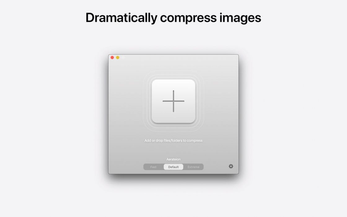
Aerate →
Aerate is a category leading lossless image compressor for macOS. Easily and dramatically compress PNG and JPG images using all new engines and settings. Save results individually, and with the new multi-core mode, process bulk tasks at unbelievable speeds.
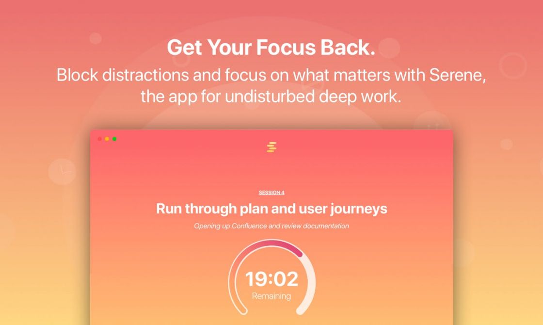
Serene →
Say goodbye to digital distractions and hello to undisturbed deep work with Serene, the macOS app for laser focus. Block distractions and focus on what matters with Serene, the app for laser focus.
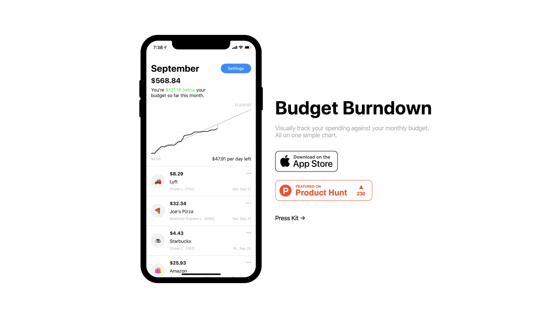
Budget Burndown →
Visually track your spending against your monthly budget. All on one simple chart. View your total amount spent and unified transaction history across multiple cards. It's automatic. There’s no sign up. There's dark mode. There's even a widget!
Goods & Gadgets
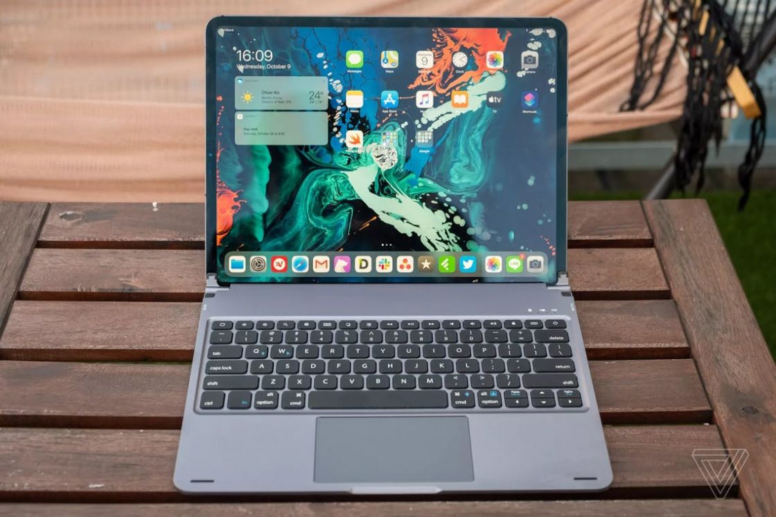
Libra Case for iPad →
A Bluetooth keyboard with trackpad, backlit, and function keys to provide a user experience like a MacBook, without sacrificing the advantages of a tablet. Maximizes your iPad productivity while at home or on-the-go. Compatible with iPad Pro 11" and 12.9".
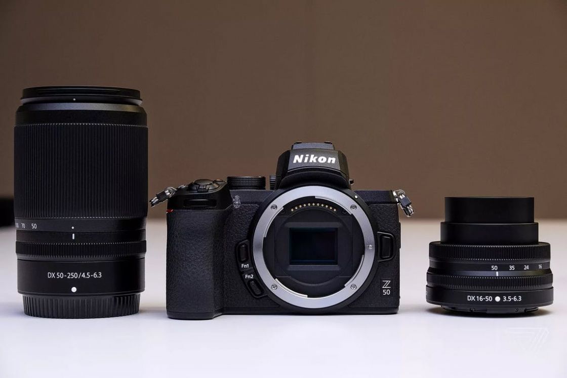
Nikon Z50 →
Small in size but big in image quality, the Nikon Z 50 unleashes your unique creativity from day one. Combining the unrivaled potential of the Z-mount system with simple, well-thought-out camera operation, it helps you in making stunning images.
Useful Resource
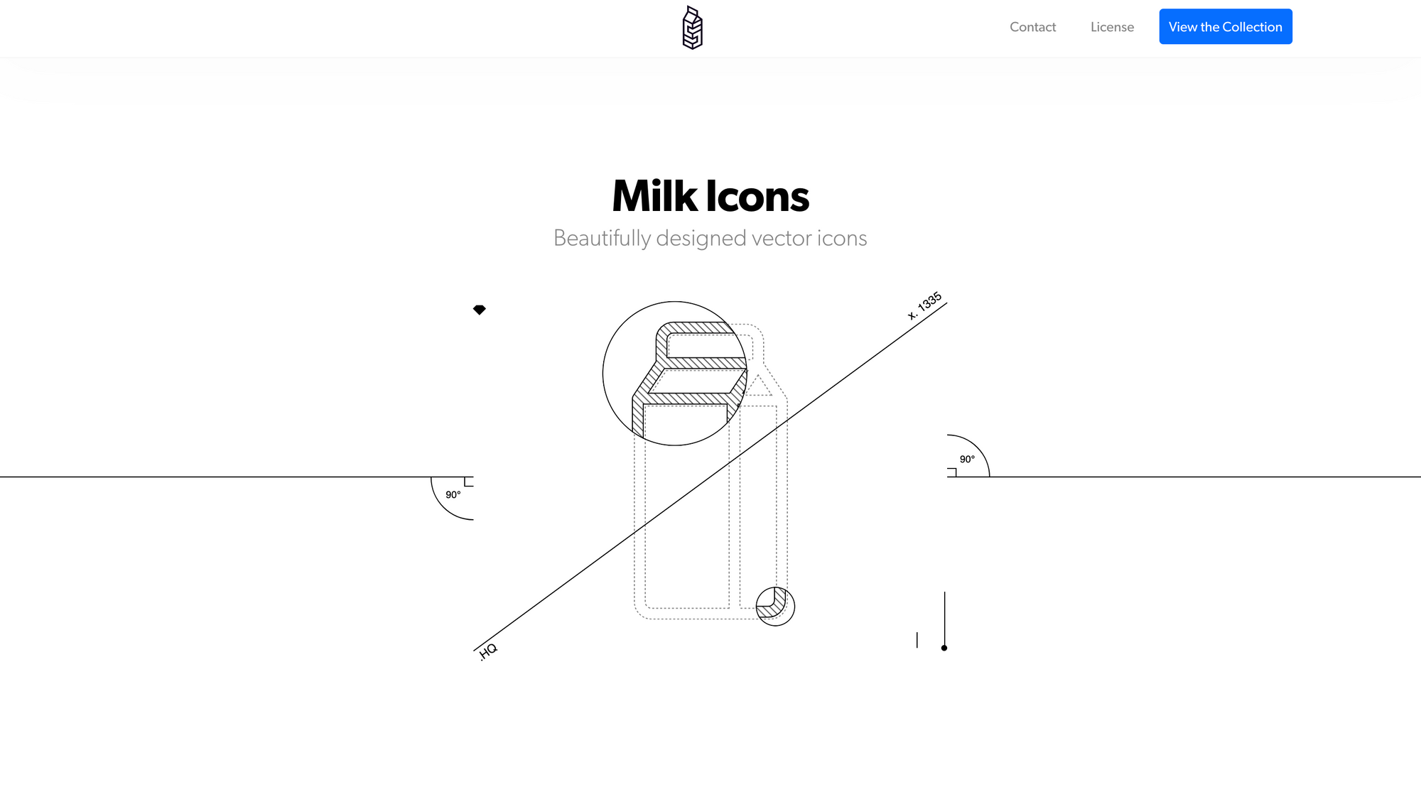
Milk Icons →
Milk Icons are a library of over 1,000 static icons and 300+ animated icons crafted on a 25 px grid.
Mental Wealth
➢ What operating rooms can teach us about ‘calm’ design – “Evie Powell is a virtual reality engineer and the lead UX designer for Proprio, a surgical imaging company that fuses human and computer vision to create a powerful system for surgical performance and training. She spoke to Doreen Lorenzo for Designing Women, a series of interviews with brilliant women in the design industry.”
➢ There’s already a blueprint for a more accessible internet. If only designers would learn it – “The internet can be a hostile space for 15% of the world’s population who experience some form of disability. Try navigating a website as someone who is visually impaired: Turn on voice command on your computer (Command ⌘ + F5 if you’re on a Mac, enable Navigator if you’re on a PC) and go to Amazon’s Kindle store. You’ll quickly find out that those who rely on voice commands can’t skip around and are doomed to listen to every notation about every page element before getting to the one piece of information they need.”
➢ Aesthetics and Perception – How to Approach User Experience Imagery – “When it comes to UX design and user experience imagery, whether on websites, mobile applications, or any other digital product, many designers choose images using their personal aesthetic sense, combining them with microcopy and the rest of the interface in a way that makes sense in relation to the product purpose and branding.”
➢ When your design is good enough – “What is bad design and does make design good? Disclaimer: in this article you won’t find a list of a random number of things that are killing your UX or step-by-step process to take your design on a different level. In fact it’s only 2 questions that your design needs to answer in order to be good enough.”
Typeface of the week
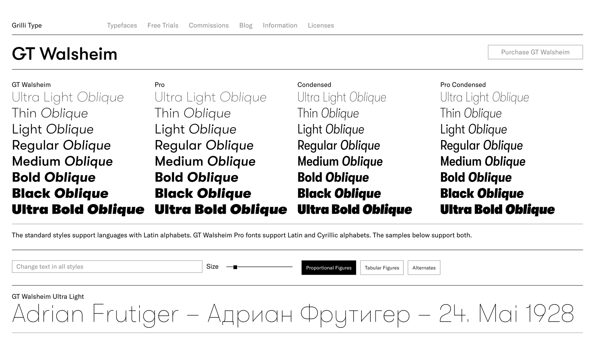
GT Walsheim is a geometric sans-serif typeface designed by Noël Leu and released in 2010 through Swiss foundry Grilli Type. The design was inspired by the hand-painted lettering found on the 1930s posters of Swiss designer Otto Baumberger. I think GT Walsheim has a lot of interesting characteristics that distinguish it from other geometric sans, such as the bar that juts outward on the uppercase G. GT Walsheim is available in eight weights—ultra light, thin, light, regular, medium, bold, black and ultra bold—each with matching obliques..
Twitter thoughts
University degrees are the new taxi medallions.
— Nav.al (@naval) October 11, 2019
Till next time! 👋
Support: You have a friend who is looking for inspiration, news about design, and useful tools and apps? Forward this newsletter to a friend or simply share this issue and show some support. You can also show some love by simply clicking the button down below and keep this newsletter a sustainable side-project by buying me a coffee. ☕️ 🥰
Disclaimer: My posts may contain affiliate links. If you buy something through one of those links you won't pay a penny more, but I'll get a small commission, which supports this blog and also my side-projects. So consider buying something through my links. Thank you!
Discussion