The art of managing creative space & Form habits that last

In this week's issue of Creativerly: Start with a blank canvas, all your notes - on one map, is the era of major rebrandings over, and a lot more.

You are reading Creativerly, the weekly digest about creativity and productivity-boosting tools and resources, combined with useful insight, articles, and learnings from the fields of design and tech. The newsletter built for the creative community.
Hey and welcome to issue 50 👋
As a kid, I did not read very much. Actually I never touched a book until I was 14. At that age, we had to read some books in class. But I never read those books. I always searched for summaries on the internet, which prepared me for the test.
Today reading a book is one of my absolute favorite hobbies. In 2018 I read 10 books, in 2019 25 books, and how much will I read in 2020? I am not sure. I have learned from the 25 book challenge from last year, that I enjoy reading the most when I just have some time, sit down, and read a book. Simple as that. During the 25 book challenge, I often forced myself to read a book just because I thought I have to read now if I want to finish the challenge. Therefore I did not enjoy some books as much as I wanted to.
For this year I am not doing a challenge like that. I just want to read as much as I can, and also enjoy every single book I read. Nevertheless, there are several books on my reading list, which I can not wait to read. Therefore I wrote a blog post about some must-read books for 2020. You can check out the blog post here.
Which books are on your reading list for 2020?
If you have recommendations or feedback, drop me an email or a tweet. For now, enjoy the newsletter! 🥰
Apps, Software, Tools
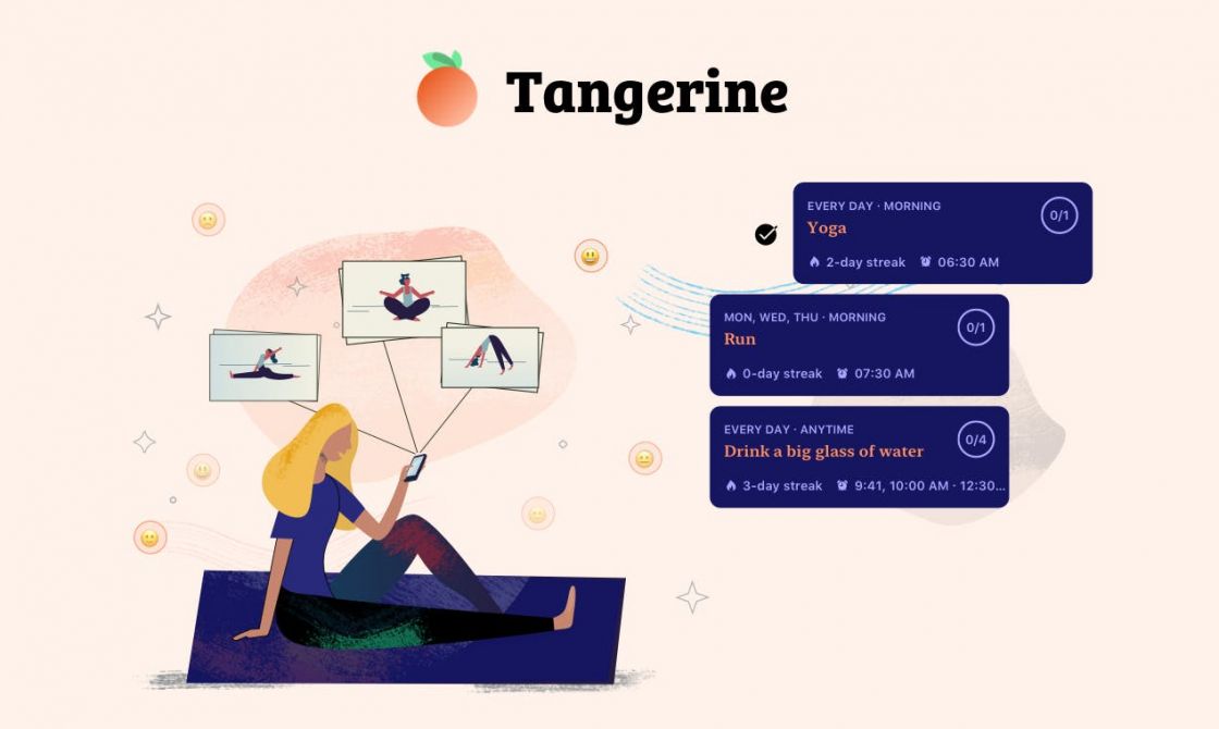
Tangerine →
Form habits that last. With a simple, beautiful, and insightful little app. Tangerine is a simple habit and mood tracker that helps you organize your routine, achieve your personal goals and reflect on your life.
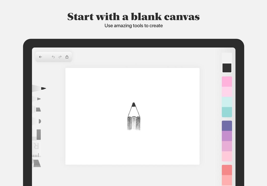
Charocal →
Charcoal is a minimalistic and modern drawing app. It's super easy to use and has support for iPadOS features like dark mode and multiple windows. And it's free!
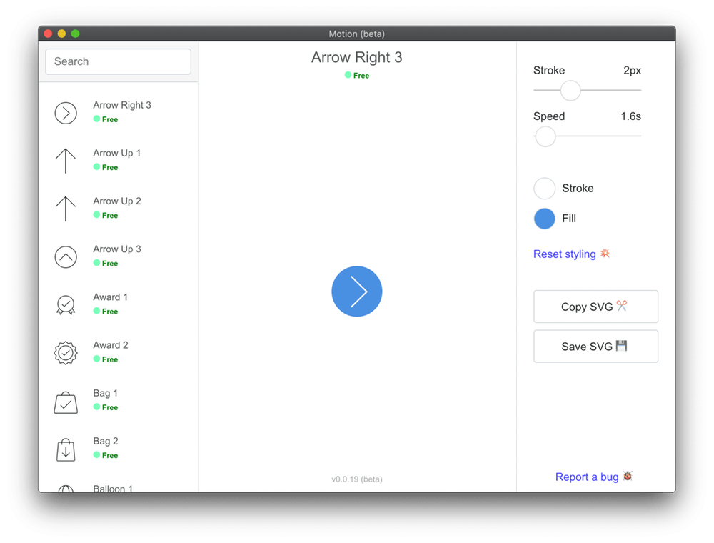
Motion →
Motion is an animated icon editor! It lets you quickly find an icon you like, made some tweaks and adjustments and plug it into whatever project you are working on! There are hundreds of icons to use and it's free!
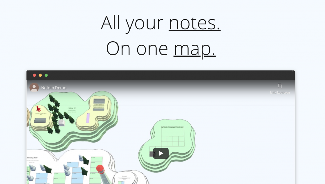
Nototo →
A notetaking app that allows users to create a visual map of their notes, and insert additional visual cues to further assist with information retention.
Goods & Gadgets

Leica M10 Monochrome →
The new M10 Monochrom has all of the design traits and features of the M10 (or more accurately, 2018’s M10-P), such as a slimmer body and wireless connectivity, but with a new 40-megapixel black-and-white sensor.
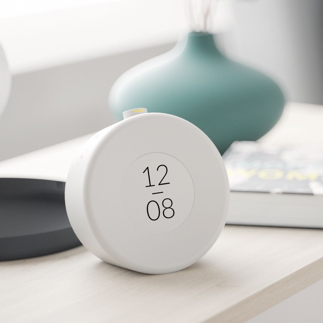
Mudita Bell →
Wake up rested and relaxed with the Mudita Bell Calming Alarm Clock. Scrolling through your smartphone before bed exposes you to blue light, keeping you alert long after you should be. This alarm clock aims to replace your smartphone so that you can get the rest you need. With its beautiful E-Ink screen, you’ll have a way to track time that doesn’t tempt you to read the latest story. The alarm itself plays acoustic sounds that gently nudge you awake.
Useful Resource
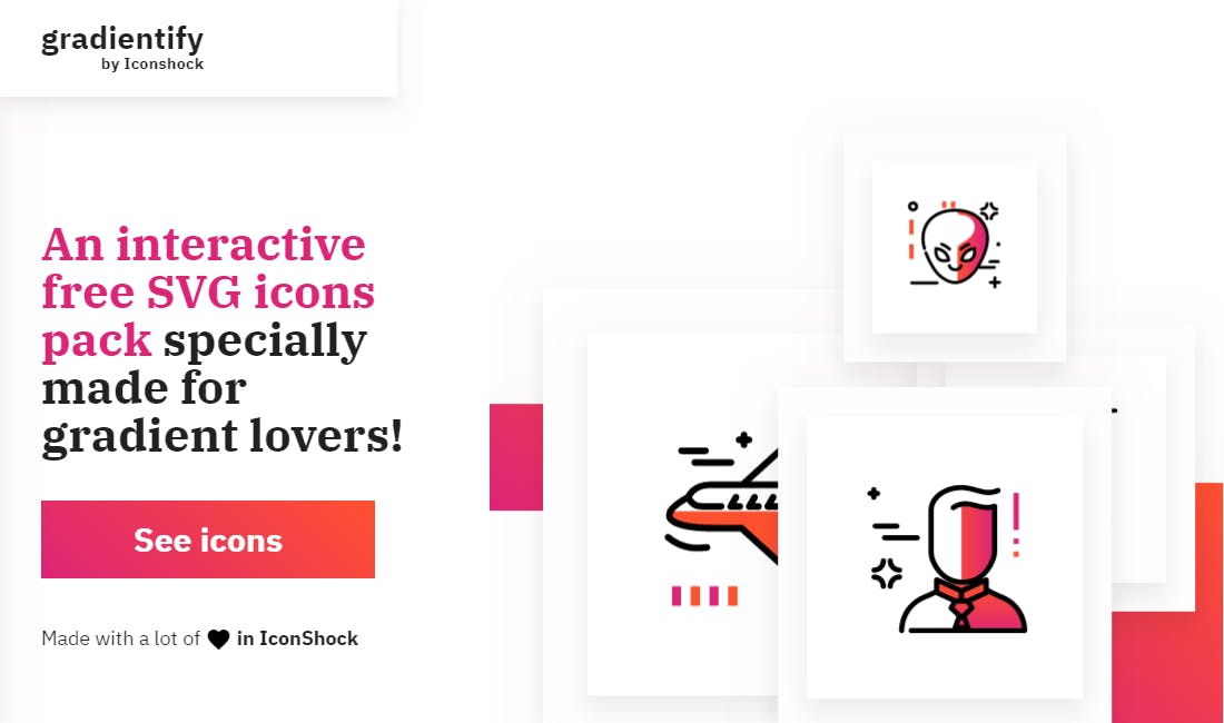
Gradientify Icons →
Gradientify is a free, interactive SVG icons pack, customizable with a simple yet powerful gradient editor, which allows you to create unique gradient color palettes or pick from a selection of 100+ trendy premade gradients.
Mental Wealth
➢ Design Tempo: the art of managing creative pace – “Designers are managing creativity to answer business needs. Creativity and creative teams cannot be managed like any other field. Designers just like any specialists need specific management skills. Let’s put all that into music. Creativity isn’t magic, creative people aren’t gifted by nature. Creativity is triggered by multiple factors. These factors are altering one’s capacity to be creative and show that creativity can be enhanced over time and can be affected if one of these factors are stressed. Process englobes creative thinking processes, they require knowledge and practice and are core to pretty much every creative fields.”
➢ The Role of Animation and Motion in UX – “In UX, motion, and animation can be helpful and communicative if used with restraint. Motion is most often appropriate as a form of subtle feedback for micro-interactions, rather than to induce delight or entertain users. In this article, we explore the purposes of use, unobtrusive feedback animation. In a second (forthcoming) article, we will discuss the details in timing and movement to make these animations appear smooth and natural. The big advantage (and also drawback) of UI motion is that it attracts user attention. Our peripheral vision (specifically, through the rod-shaped photoreceptors in the human retina) is responsible for detecting motion. Evolutionarily, the fact that we can detect a movement outside the center of our field of vision is, of course, an advantage: we can discern danger and protect ourselves. But that means that we are sensitive and prone to be distracted by any type of motion (meaningful or not). That’s why motion in user interfaces can easily become annoying: it’s hard to stop attending to it, and, if irrelevant to the task at hand, it can substantially degrade the user experience (as any web user who has encountered a moving advertisement can attest).”
➢ Is the era of major rebrandings over? – “You might notice some commonalities among large company rebrands in 2019. Or rather, you might not have noticed they rebranded at all. And that’s exactly the strategy they share. In 2019, many large heritage companies went for what you might call a brand refresh rather than a redo; making small design shifts in the service of function in the digital space, and for a more performative brand across platforms. To make a haircut metaphor: major companies all opted for trims that might make you ask, “Did you do something different?” No one went for full-on bangs. Let’s take a look at just a few of the brands that have adopted this strategy of incrementalism, opting for a touch-up rather than an overhaul.”
➢ What I learned from rejecting design candidates — and what you shouldn’t do as an applicant – “I get it. We all dream about that one company where we want to work, that one place we want to call ‘my office’, and that one team we wish to be a part of! We all have goals, aspirations, and dreams — and they do come true. Ouch. That hurt. I was really in love with my company, my team and the products we were building. But it was time to leave. I couldn’t work remotely or stay there forever. So, back in September 2019, I started receiving emails from the HR department, who had shortlisted around 50 candidates for review. One after the other, I started reading their resumes and cutting down the number of profiles to half, so that it was easier for me to decide which candidates are eligible to at least be called for an interview.”
Essential Reading
➢ Brief Answers to the Big Questions by Stephen Hawking - Is there a God? How did it all begin? Can we predict the future? What is inside a black hole? Is there other intelligent life in the universe? Will artificial intelligence outsmart us? How do we shape the future? Will we survive on Earth? Should we colonise space? Is time travel possible?
Throughout his extraordinary career, Stephen Hawking expanded our understanding of the universe and unravelled some of its greatest mysteries. But even as his theoretical work on black holes, imaginary time and multiple histories took his mind to the furthest reaches of space, Hawking always believed that science could also be used to fix the problems on our planet.
And now, as we face potentially catastrophic changes here on Earth - from climate change to dwindling natural resources to the threat of artificial super-intelligence - Stephen Hawking turns his attention to the most urgent issues for humankind.
Typeface of the week
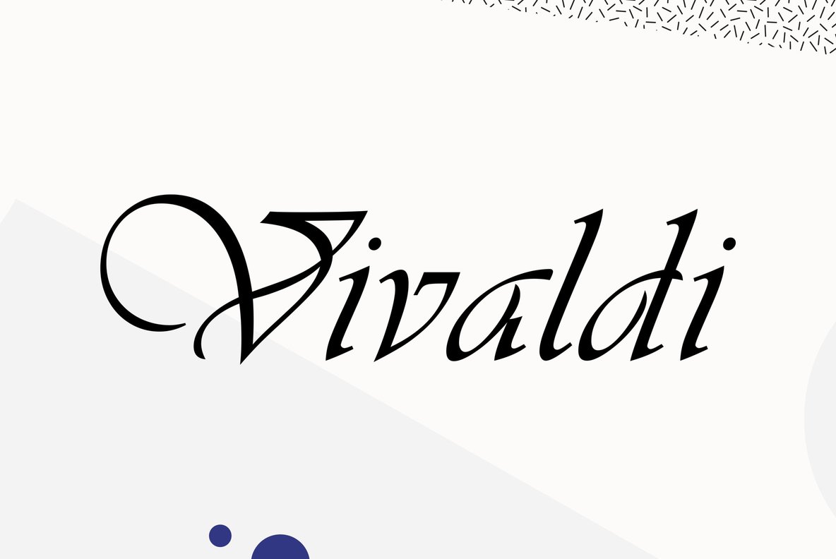
Vivaldi is a script typeface designed in 1966 by Friedrich Peter. The design features elaborate capitals with a more subdued lowercase. Vivaldi is included as a default font in Microsoft Office, so it’s fairly common to see it used on invitations, certificates and anything requiring a formal appearance.
Twitter thoughts
To achieve success, you must be willing to take risks.
— James Clear (@JamesClear) January 24, 2020
To take risks, you must be willing to be vulnerable.
Therefore:
To achieve success, you must be willing to be vulnerable.
Till next time! 👋
Support: You have a friend who is looking for inspiration, news about design, and useful tools and apps? Forward this newsletter to a friend or simply share this issue and show some support. You can also show some love by simply clicking the button down below and keep this newsletter a sustainable side-project by buying me a coffee. ☕️ 🥰
Disclaimer: My posts may contain affiliate links. If you buy something through one of those links you won't pay a penny more, but I'll get a small commission, which supports this blog and also my side-projects. So consider buying something through my links. Thank you!
Discussion