Creativerly‘s Favourite Apps of 2022
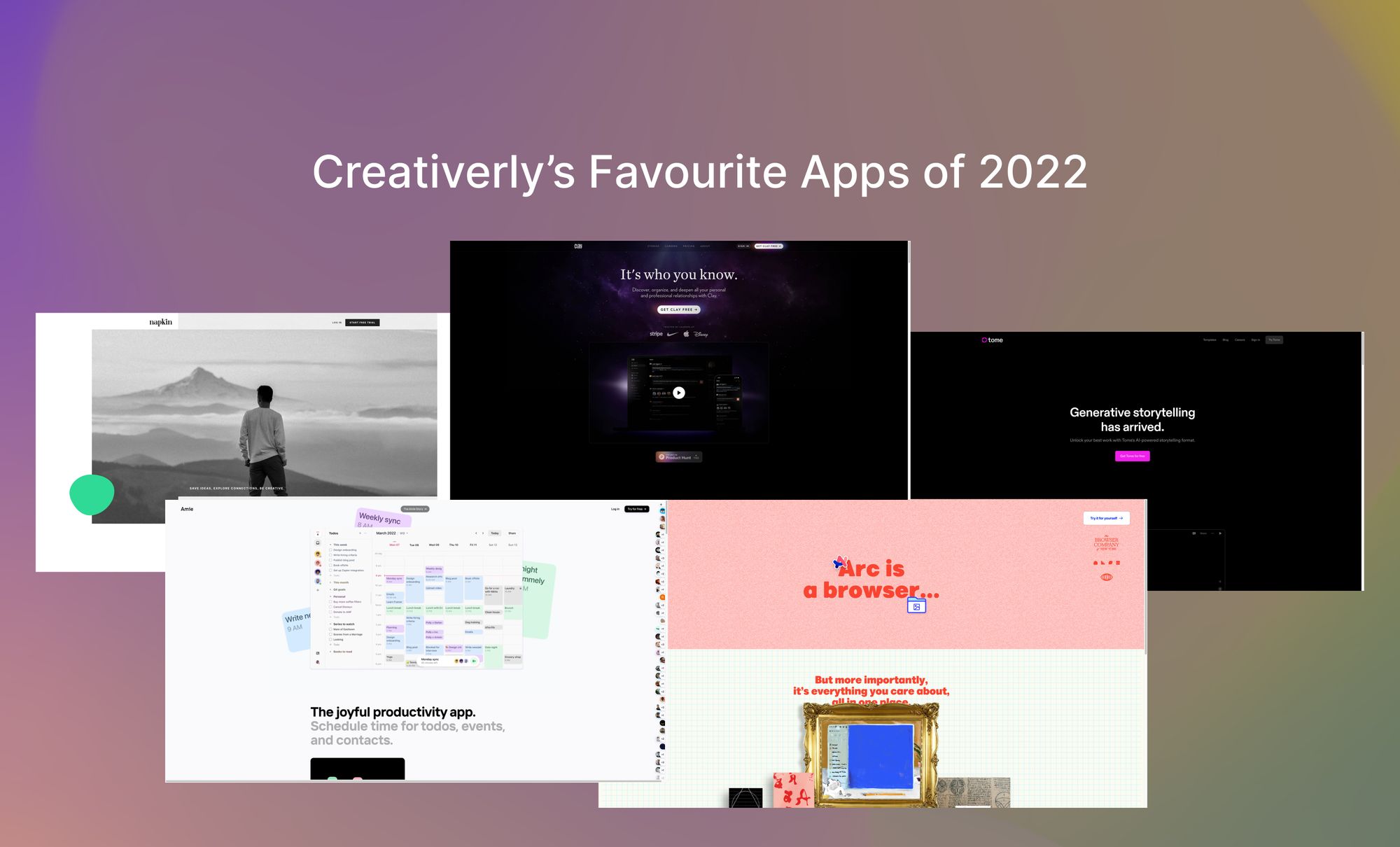
I sat down and reflected on five apps that stood out to me throughout 2022. Here are Creativerly's favourite apps of the year.
You are reading Creativerly, the weekly digest about creativity and productivity-boosting tools and resources, combined with useful insights, articles, and findings from the fields of design and tech. The newsletter built for the creative community.
A year ago, I kicked off this new tradition by gathering my favourite apps of the year to highlight them and the incredible teams behind those apps, carefully crafting and building beautiful software. Fast-forward to today and it is time once again to gather my favourite apps of the year 2022. I picked the following apps because they stood out to me when it comes to their features, their design, the updates they have received, how they evolved and developed throughout the year, the workflows they give us access to, and ultimately because they are simply put, incredible powerful. So, keep in mind that this selection is based on personal opinions. There are loads of incredible apps out there, loads of awesome updates has been shipped over the course of the last twelve months, but the apps down below, just stood out to me personally.
I do not have any specific categories planned (I will might do this next year, though), I just wrote down the first apps that came to my mind when I thought about apps that left a mark for me throughout the year. So, no matter if it is a productivity, note-taking, PKM, creativity, or any other app, if there was a feature, a design, an update, or anything else that stood out to me, it made Creativerly‘s favourite apps of 2022 list.
The procedure of selecting Creativerly‘s favourite apps of 2022 was again a very special one for me. Since I am working on an app as a product designer myself every single day, I know what it means to craft and design an app, ship updates frequently, shape and evolve a product, and satisfy users‘ needs. Therefore, the apps that have made this year‘s list but especially the teams and makers behind those apps got my outmost respect of shaping, building, and evolving such amazing products.
Without further ado, let us get into Creativerly‘s Favourite Apps of 2022.
Arc
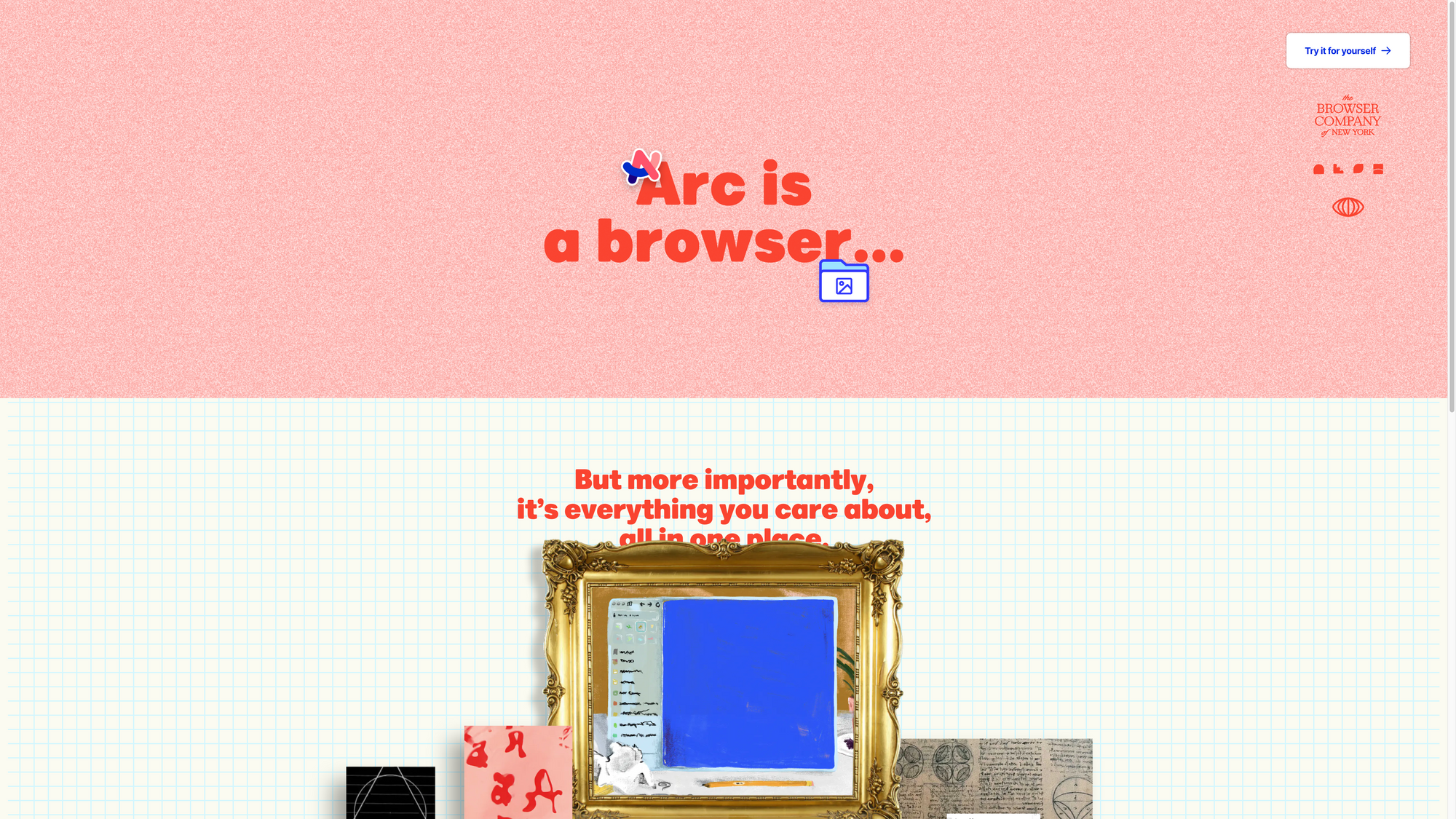
There is no doubt that Arc is one of the most exciting tools of 2022. For me personally, none other app created that much buzz around it throughout the last 12 months. The reason for that is simple. Arc has initiated a browser revolution. Within the last couple of years, browser became incredible powerful. So powerful, that a lot of people heavily rely on browsers and their performances for their daily work. No matter if you want to design, write, create animations, illustrations, 3D object, manage complex projects and processes, you can do everything and even more right within your browser of choice.
While browsers became more powerful than ever, Chrome has been suppressing every other alternative for way too long. Therefore, it is exciting to experience the current browser revolution. Tools like SigmaOS, Stack, Sidekick, Beam, Vivaldi, and other are trying to reimagine the way we interact with the web. Those browsers and Arc are working on turning the browser into a creative space with creative opportunities to build on, create, and interact with the internet. While I have used all of the mentioned browsers, Arc stood out to me, and ultimately became my default browser.
Arc not only is a revolution within the fields of browsers because of its beautiful interface, it also has some incredible features that boost my productivity, makes switching between projects easy, and gives me the creative freedom I was always looking for when I tested „modern“ browsers. But what makes Arc different to other browsers? First of all, Arc features a high standard for craft, design, and detail when it comes to the interface and user experience. There is something magical about using beautifully designed software, and Arc is the perfect example for it. It started with the onboarding experience and continued throughout the whole app.
Whenever people saw my browser, they were amazed by the number of tabs I have constantly open. I am not a tab hoarder. I just like to work across multiple tabs and keep information right at my fingertips instead of saving it within a bookmarking tool just so I forget about it. Most of nowadays browser do not let me use a workflow like that, because using a high number of open tabs or even windows to manage and structure different projects you are constantly working on, not only slow down your browser experience but your complete working machine. There are indeed browser extensions that aim to give you the chance to work across loads of tabs, but none of them clicked for me. Within Arc, I can create dedicated workspaces for different use cases and projects.
On top of that, I pinned my most used sites and organised them within folders, so I always know where my tabs are. With Shortcuts I am able to navigate through my spaces and my open tabs, create new folders, set up split views, and more. Arc even lets you create nested folders, which is a huge plus when it comes to structuring and organising your work. Arc does indeed take up some space on your RAM (obviously) but it is nothing comparable to Firefox with loads of tabs open. Arc delivers a constant performance because tabs you do not pin will get archived after 24 hours so you can always be sure to work with speed and performance within your browser.
One of my most favourite features of Arc is Split View. This allows me to open multiple tabs side-by-side. It has been pure joy for me to use this feature for my writing process over the last couple of days. With a recent feature, Arc reworked the Split View treating it as separated tabs, which stays open when you switch to a different tab or workspace.
Just after a couple of hours of usage, the tabs in the sidebar of Arc already felt like a no-brainer. The more time I spent with Arc, the more I realise how powerful it is, and how desperate I was in the need of a new browser experience.
So far, it has been pure joy to use Arc, and I looking forward to what they have planned in the future.
Congratulations to Arc and the whole team for building, creating, and crafting such an amazing tool.
Amie
Amie is another app that created incredible buzz around itself. The first time I wrote about Amy, was back in July 2020. It was more like a simple feature, since back then Creativerly was purely focusing on curating content instead of actually creating content. In issue 161, I wrote about Amie once again, since at that time, Amie officially launched their beta app, so they started to open up their waiting list.
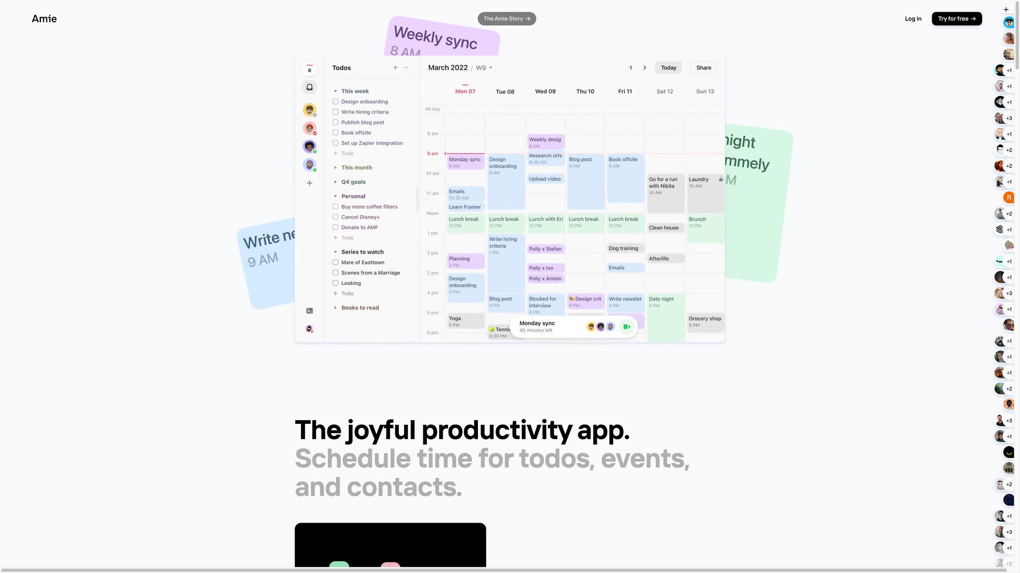
Amie combines your calendar with your to-do list. There are a couple of apps, that follow a similar or even the same approach. But here is a bold statement: none of them show such an incredible level for craft and detail when it comes to the design of the user interface. Amie is, without a doubt, one of the most beautiful apps out there. Since I am a Product Designer, I just love to use apps that feature such high standards for user interface design and the user experience in general. Amie entitles itself as „The joyful productivity app“ and they deserve this title to the fullest. With Amie, you can turn your calendar into a todo list, use different color options to organise your calendar, instant know someone is available, track what you listend to, and send out probably the most beautiful scheduling links.
With just a few clicks, you can share your availability with your friends, colleagues, or your family. Additionally, Amie is also the perfect tool to keep track of personal things and stay on top of all your todos. If you are using Amie within a team spread across different timezones, Amie makes it incredible easy to see multiple timezones within your calendar, which is such a lovely feature for remote work. Within a team calendar, Amie gives you direct access to your team-members within your sidebar. To fly through Amie and your calendar blazingly-fast, the whole app has been optimised to be used with keyboard shortcuts. With a single shortcut though, you get access to the command menu which lets you search or jump to anything in real speed.
As of writing this, Amie is available as a web app, for macOS, and iOS, with Android support coming soon. The team behind Amie, has been constantly shipping outstanding updates and improvements throughout the whole year, closed a $7m seed round led by Spark Capital, grew the team, created the Amie blog (which of course is a calendar), and they brought so much joy to users who rely on Amie every single day (including me).
Amie is one of those tools that just make sense. It solves a problem for me, and while doing so, it brings me joy. Whenever I open up Amie, no matter on my computer or on my iPhone, I realise that I am smiling, because using apps in my daily life that are just as beautiful as Amie makes me incredibly happy.
Congrats Amie, Dennis, and the whole team for being one of Creativerly's favourite Apps of 2022.
Tome
While calendar and PKM apps still dominated the whole productivity space of 2022 in my opinion, we also saw a spike and increasing popularity when it comes to presentation and storytelling software. I got incredibly excited about that area, when I saw that Henri Liriani came out of stealth with Tome back in March 2022. Yet again, I immediately got hooked on a tool because of its craft and love for great design.
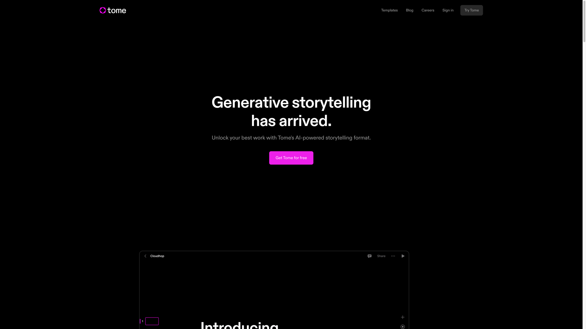
At the core, you can think of Tome as a presentation tool. But instead of creating Slides as you would in traditional presentation tools, Tome is built on a system of tiles and those tiles can power every type of content you can think of. No matter if you want to write down your ideas in a dedicated markdown editor, crop and frame images, or trim and autoplay video, Tome got you covered. To make your story interactive, Tome lets you display content from the web from tools like Airtable, Figma, Framer, Codepen, and others. On top of that, Tome was designed to display your content and showcase your story always beautifully, no matter if you are on a desktop or on mobile, Tome always feels native.
Since working together and collaborating with your team is always fun, Tome lets you collaborate in real time and keep everyone in the loop. No matter if you want to create small stories like sharing an open job position or a design tutorial, or if you want to share big stories like demoing products and showing off your hard work with clarity and elegance, Tome is an incredible tool to achieve all of that.
During the huge boom of AI in 2022, Tome quickly realised and took action, since they saw a huge opportunity to leverage the power of AI for storytelling. So, Tome became a collaborative AI partner, right at your fingertips. Just type a prompt and watch Tome generate entire narratives from scratch or create additional content pages within seconds. You can even use Tome's Dalle-2 tile to create compelling images, tailor-made to bring your idea to life.
If you ever wanted to build a powerful story with any type of content, Tome is a lovely tool that gives you all the features you need to take storytelling to another level.
Welcome to Creativerly's favourite apps of 2022, Tome, so well-deserved!
Clay
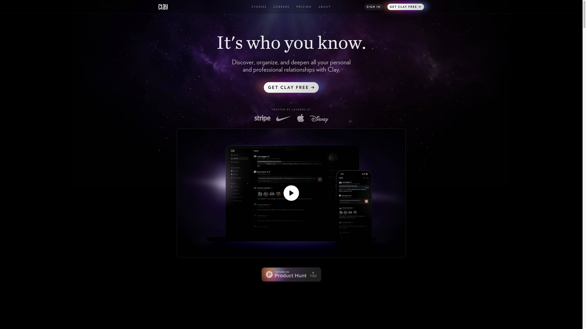
In 2022, I got introduced to Clay, a CRM tool. For the longest time, I wanted to keep track of the personal connections I have made with folks. While I started building CRMs manually in Notion and Airtable, I was on the hunt for dedicated CRM tools. I tried out a lot of apps, but none of them convinced me. When I signed up for Clay, I quickly got the impression that I finally had found the tool I was looking for. Clay is a powerful tool to discover, organise, and deepen all your personal and professional relationships. And besides that, it is one of Creativerly's favourite apps of 2022.
With Clay, you get the possibility to automatically build a collection of everyone you know. This is possible by securely connecting your email, calendar, Twitter, LinkedIn, and iMessage. There is no more need to enter information manually, mindless tagging, and out-of-date details. Clay makes sure to create the CRM you have always dreamed of by populating photos, bios, education and work history, location, and social profiles automatically, and keeps everything updated over time.
Every single bit of Clay is beautifully designed, with a love for detail. Besides that, every feature within Clay is intentionally crafted to introduce serendipity and chance into your network to recreate that feeling of running into someone on the street or seeing an old friend. You will not experience this with any other CRM tool out there, believe me. Since you remember people in different ways, Clay gives you a powerful search, that allows you to just type what comes to mind and Clay will find the right person or group of people based on your notes and their profile. All of this just happens within milliseconds. It is without a doubt, the easiest and most powerful person search available anywhere.
2023 should be the year in which you start strengthening your connections and building up your network. While doing so, make sure to sign up to Clay to not only use the most powerful tool for discovering, organising, and deepening your personal and professional relationships but to also experience joy and pure delight while using it.
Congrats Clay and the whole team for building such a lovely tool and for becoming part of Creativerly's favourite apps of 2022.
Napkin*
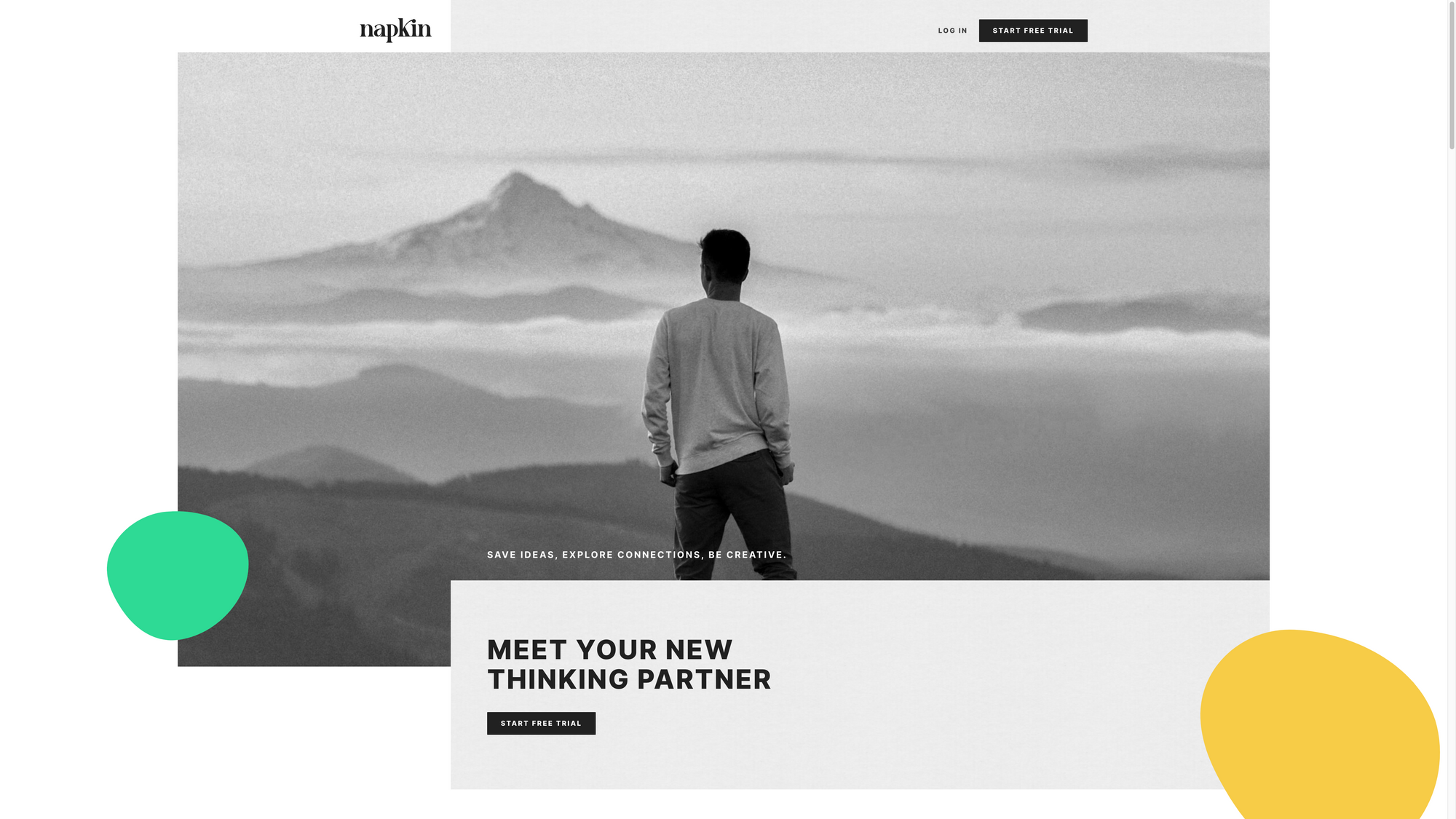
When I heard about Napkin for the first time, I was incredibly intrigued by the concept of it. Then, I had the honour to receive a personal demo from co-founder David Felsmann. After hearing his thoughts about PKM apps in general, how Napkin is different, and what the team of two has planned for the future, my excitement rose to another level.
While setting up your systems in other PKM tools usually need some know-how beforehand, Napkin* wants to make it as easy as possible to get started collecting and connecting your thoughts. Do not mistake Napkin as a full-fledged note-taking service. In Napkin, you will not find all the features traditional note-taking apps are offering. Therefore, you cannot compare Napkin, nor does it compete, with tools like Roam, Obsidian, or Logseq. David and Fabian (the co-founders of Napkin) never intended to build a substitute for those apps. Napkin is aimed at writers, content creators, creative minds, and everyone who wants to jot down and capture individual thoughts or think in smaller bits of ideas.
The notes you create and collect within Napkin are not stored or organised within folders as you would expect it from traditional note-taking tools. Napkin organises the content you create completely visually. Notes and thoughts are cards, which are placed on a canvas. Napkin's canvas works differently from other visual-first apps. The cards are floating on the visual canvas, so you can see how your notes and thoughts are connected. To explore the connections you have made, you can simply click on one card, and Napkin will highlight the relevant information.
Napkin is not trying to be the tool for everything and everyone. If you have a solid note-taking system already in place, Napkin will not replace it, instead, it will extend it with the power of capturing and connecting your ideas. While Napkin is your thinking, ideation, and inspiration space, your preferred note-taking and writing app is your production space.
Napkin is, undoubtedly, one of the most exciting products I came across in 2022. It is no longer a secret, but visual-first tools are the future, and Napkin is part of this future.
Congrats Napkin for becoming one of Creativerly's favourite apps of 2022.
That is a wrap! Five apps and tools that deserved it in my personal opinion to be highlighted once again, because of the awesome features they have shipped, the bugs they have fixed, the powerful workflows they gives us access to, and the amazing design they have crafted that brings us joy whenever we are using those apps.
Congrats to all the awesome makers and teams out there crafting incredible tools that boost our creativity and productivity! You are rocking!


Discussion