Creativerly’s Favourite Apps of 2023
In this post, I am looking back at the past 12 months and reflect on the apps that became my favorites of the whole year.

Throughout 2023, I incrementally re-evaluated all the tools I use on a daily basis not only to write, build, and maintain Creativerly, but also to manage both my personal and professional projects. In issue 243 of Creativerly I wrote about an unconscious practice of mine that led to abandoning some apps, but also adding some new ones to my stack.
Striving for simplicity does not mean dumbing things down or removing features. It is about understanding what truly makes a tool or workflow useful and optimizing it for a seamless user experience. Additionally, I have the feeling that loads of users already used a specific app in the past that covered all their needs, but since ‚shiny-app-syndrome‘ is actually a thing, they got attracted to a new app that might even deliver a worse experience than before, but because it has been shared and discussed online, they felt the need to give it a try. Therefore, take this post with a grain of salt. While you will probably feel the excitements in my words about the following apps, I urge you to stick to the workflows which are already working for you. Before switching your note-taking, task management, project management, or any other productivity tool within your stack, make sure to ask yourself why you are taking notes, what the purpose of managing your tasks and projects is, and in general why you use a specific piece of software.
I am taking notes and journal every day since I want to build up a knowledge base and make sense of my discoveries, events, books, and articles, but it also helps me while working on my projects, generating new ideas and sparkling new thoughts. Keeping those practices in mind, almost every single note-taking or knowledge management software would be a fit, theoretically. Among them, there are countless options which are way to complex, packed and bloated with features I do not need, and simply do not assist me and my workflows. If you are struggling to find the right tool for your note-taking practices or if you want to build your knowledge base/system but you have no idea where to start, I recommend reading and joining the Calmer Notes Method by Elizabeth Butler.* Calmer Notes is an eBook and course built for busy people, who are frustrated with their note-taking workflows, devoting much more time to getting organized instead of actually creating, and who are looking for a better way to organize their digital lives.
While the Calmer Notes Method* is tailored at note-taking and knowledge management, some of the practices described within the eBook can be transformed to find the task, project, calendar, or time management that fit your workflows. Keep in mind to always ask yourself what you would like to achieve with a note-taking, task or project management practice, before diving into a piece of software simply because it is buzzing online.
The apps which are part of Creativerly’s Favorites 2023 have all simplified my workflows to some extent, saved me some time I then was able to reinvest in my projects and mostly writing, and ultimately they are all a pure joy to use and experience. Down below, you will find out how that happen, how I am using the apps, and why I think they deserve it to be highlighted as one of Creativerly’s most favorite apps of the year 2023.
Let us get into it.
Bear
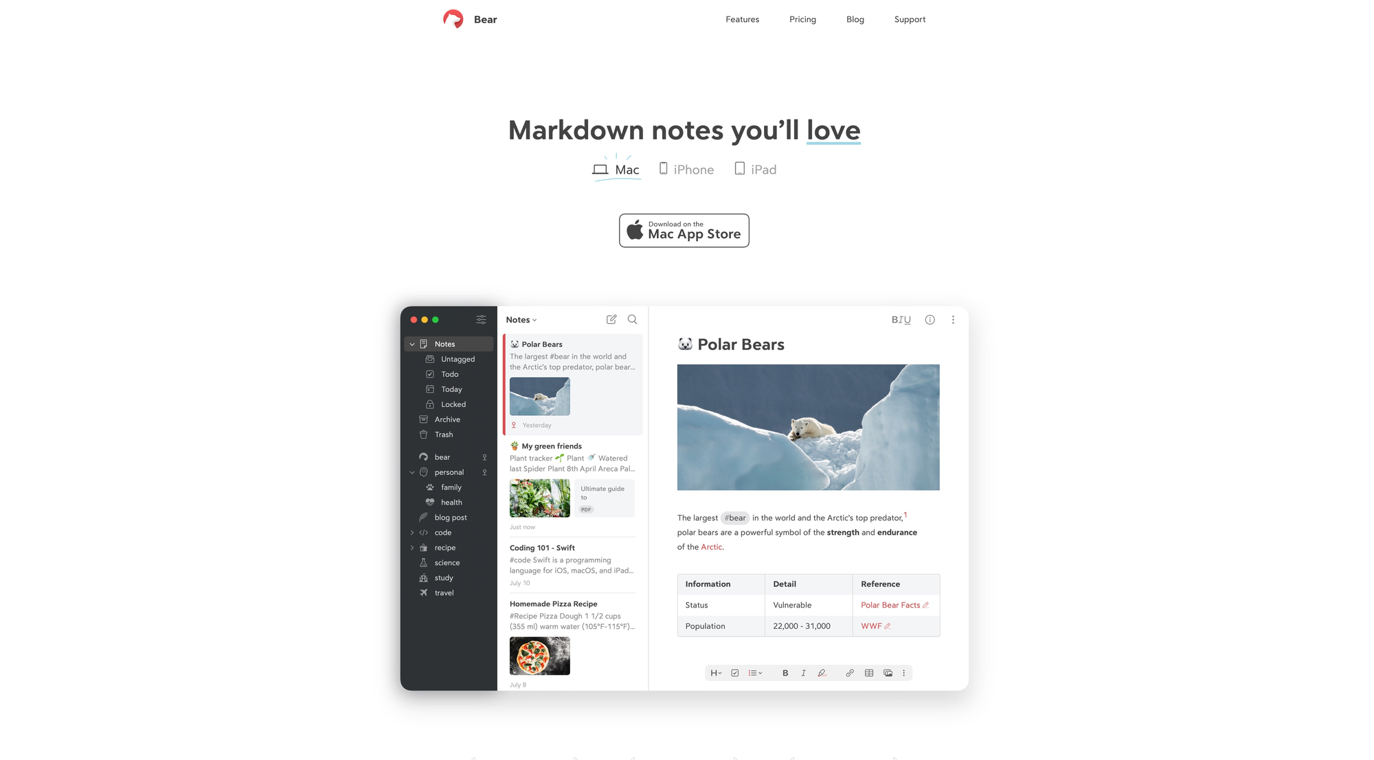
It has been one of the most exciting years for Bear and Shiny Frog, the company developing the app. In 2023, Bear received a major update, introducing v2.0 packed with lovely features. Before the update, Bear was already a lovely note-taking software, appreciated by loads of users because of its simplicity, beautiful design, distraction-free interface, and a set of features that simply worked. Bear 2 opened up for even more possibilities and opportunities. What has been teased for quite some time, finally landed on the App Store in July 2023, an update which brought over 20 new features, raising Bear’s experience onto another level.
One of the major updates of v2.0 surrounded Bear’s next-gen editor. Users are now able to use and create tables to visualize information in rows and columns, hide markdown, create nested styles, fold away sections of text, experience a completely revamped sketching experience and new canvas tools, link previews, PDF previews, footnotes, and a lot more. Besides raising the writing experience onto another level, Bear 2 also introduced an even more powerful organization. With the new info panel users can see table of contents and backlinks, which leads me already to one of the most anticipated features, native backlinks, which gives you the possibility to see a list of all notes that link to the current note. Additionally, you can now pin tags in the sidebar, experience an improved search, and use new widgets.
As all of this wouldn’t be already enough to simply love Bear, the major update brought support for custom fonts, added six new Bear Pro themes, and all-new app icons. Under the hood, Bear received some major improvements too. Large and long notes open faster than ever, their architecture is more extensible, and much of Bear’s core is now cross-platform too, meaning a large portion of its code now works across Mac, iPad, and iPhone.
The latest and last update of 2023, brought another highly requested feature to Bear. With a simple shortcut, users are now able to instantly navigate to a note, a tag, or a location in Bear, thanks to Quick Open. I knew for quite some time, that I will include Bear in Creativerly’s Favorites of 2023, but this was the cherry on top. In 2023, Bear celebrated its 7 anniversary, and while they mentioned in a blog post being thankful for their users, I am just thankful that an app like Bear exists.
Congrats Bear and Shiny Frog for becoming one of Creativerly’s favorite apps of 2023, well-deserved.
Screen Studio*
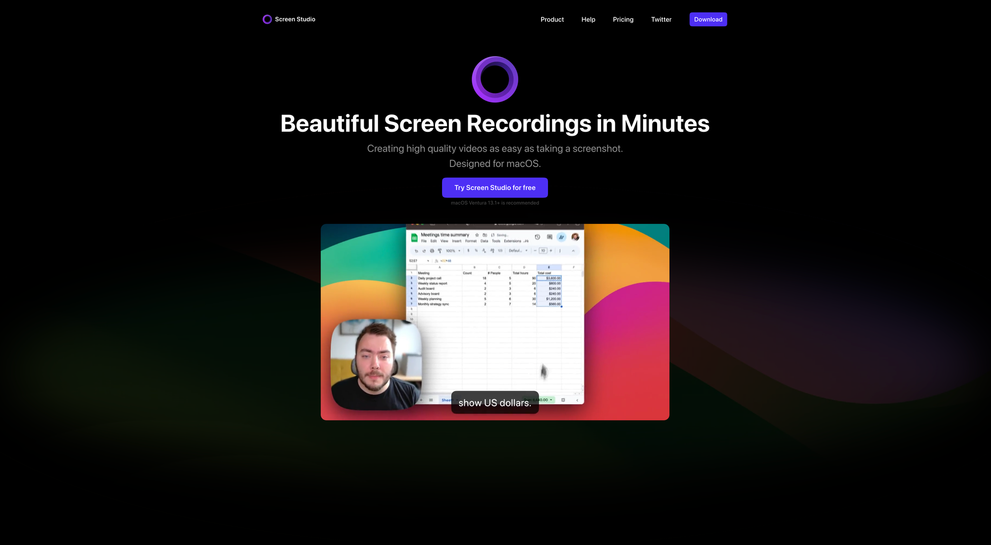
Screen Studio is one of those tools that once you use it you no longer want to miss it. For the longest time, I felt the urge to provide some more visual insights within my blog posts and deep dives about specific apps, to provide more context and actually give users a visual example of the workflows and features I have been writing about. A plain screen recording felt too bland though. Editing, animating, and creating motion designs to create more exciting and attention-grabbing videos was way too time-consuming. I was on the hunt for a solution which would give me the possibility to create beautifully screen recording in minutes without the need for video editing or motion design skills.
When I discovered Screen Studio, I immediately realized that I had found what I was looking for. No matter if you need to create promo videos, tutorials, product updates, demos, or social media stories, Screen Studio has all the best design patterns baked in, which gives you the possibility to create high-quality videos without the need learn a new tool or become an expert in video editing. Thanks to lovely and powerful features like Automatic Zoom, Smooth Cursor Movement, Shadow and inset, or Background and spacing customization options, Screen Studio instantly levels up your screen recordings.
I am especially a fan of the Automatic Zoom features, since it is an incredible time-saver when Screen Studio automatically zooms in on the actions you perform on screen. To edit your videos and make them look professional, no manual work is needed, as all the heavy lifting is done by Screen Studio. When creating tutorials, presentations, tips, and tricks videos, not only the recording of your screen matters, but by adding your webcam video, voice, and system audio, you can take your video onto another level. With just a few clicks, Screen Studio gives you the possibility to add and adjust your selfie, enhance audio, generate a transcript, and record system audio from all your apps.
By connecting you iPhone or iPad via USB, Screen Studio will automatically detect the model and color of your device and gives you the power to even level up recording of your mobile apps and tutorials. Thanks to varies export presets, you can be sure that your screen recording will look great, no matter where you use or post it.
All of the above mentioned plus a lot more is available for $89, which is Screen Studio’s Standard pay-once license, allowing you to install it on one macOS device, get access to all Screen Studio features, 1 year of updates, and you get to use it forever. The Extended License is great for multi-device setups or small teams, as it allows you to install Screen Studio on three macOS devices. It is available for $189.
If you would like to get a taste of Screen Studio’s capabilities check out their website or my post about the tools I use to write and build Creativerly.
Congrats Screen Studio for becoming one of Creativerly’s Favorites of 2023.
Ivory
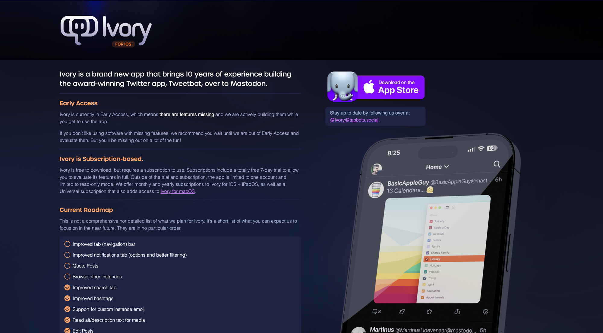
Throughout 2023, Social Networks, especially X, got disrupted. Loads of Twitter-Clones popped up, but none of them really made it. One promising Twitter alternative was Pebble, but it shut down in October 2024 due to the sizable competition coming from other Twitter rivals. Another Twitter/X rival is Mastodon, although I personally would not call it that, since Mastodon never tried to be a rival of Twitter and simply followed its own path. As Elon Musk took over Twitter and things went downhill fast, I completely moved my social network activities to Mastodon, especially since Tapbots quickly built the third-party client Ivory, based on one of their most-loved products, the third-party Twitter client called Tweetbot.
Ivory brings 10 years of building a superb and award-winning experience while browsing a social network. Once you start using it, you can clearly see and experience that. Ivory is an incredibly joyful product that offers, in Tapbots fashion, a wide range of customization features. With a couple of tabs you can change the font, text size, image thumbnail size, app icon, navigation tab bar, app icon, but also the behaviors like ignoring content warnings, tap to top, or swipe to switch themes. Mastodon itself already offers a lovely iOS app, but Ivory with its advanced features like timeline filters, the customizable UI, and the incredible performance set it apart from other alternatives.
Besides being available for iOS and iPadOS, Ivory also offers a native macOS app, bringing its lovely design and experience across all of Apple‘s platforms. As more and more platforms are adopting or experimenting with ActivityPub, the protocol Mastodon is using, we can envision a bright future for Ivory.
Congrats to Ivory and Tapbots for becoming one of Creativerly‘s favorite apps of 2023.
Readwise Reader
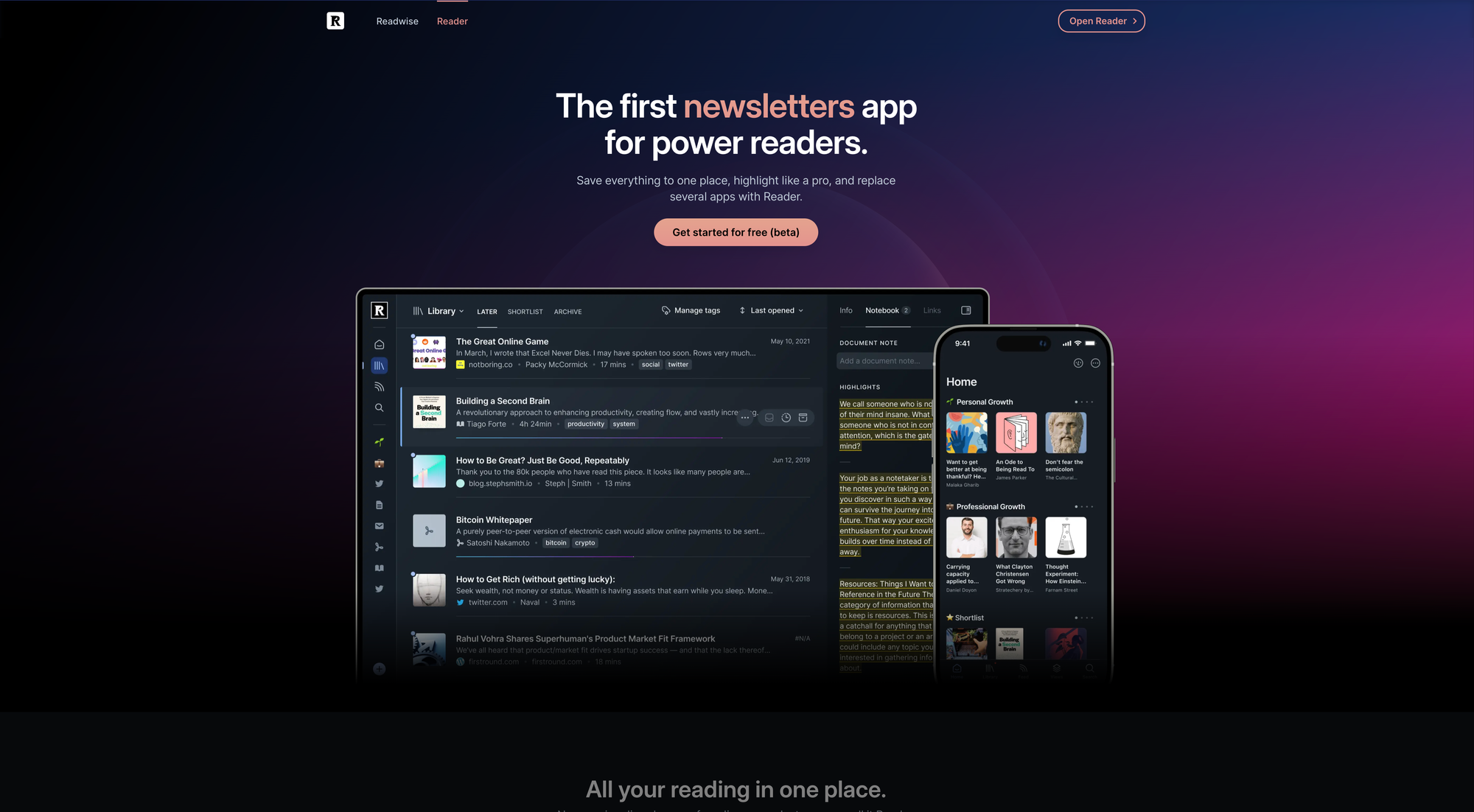
I love reading. No matter in form of a physical book, an ebook, or an article or blog post online, reading is simply one of the most enjoyable activities while providing insights and the possibility to learn something. Besides that, I am subscribed to various newsletters and RSS feeds. For quite some time, I have been using the fantastic Reeder app to aggregate all my RSS feeds and read the articles and blog posts within a lovely interface. Whenever I stumbled across an article online I would liked to read at a later time, I had to use a different app, since Reeder is just a RSS reader. Based on some recommendations and after reading a couple of reviews, I decided to give Readwise Reader a try to consolidate all my online reading practices. I started using Reader as a read-it-later app thanks to its lovely browser extension, but I also fueled it with my favorite RSS feeds.
Subscribing to RSS feeds within Reader is super easy. Saving an article that you found online needs a single click thanks to the browser extension. The interface of Reader is incredibly polished and the dedicated keyboard-based reading enables you to navigate, highlight, and annotate with grace. One of the most powerful features that I really enjoyed using until now, is Reader‘s blazingly fast full text search, which even works offline. It is pure joy resurfacing articles and blog posts, since Reader does it in a blink of an eye. Reader is also packed with some AI-powered features like Ghostreader, which is powered by GPT-3 and acts like your copilot of reading by asking it questions, defining terms, simplifying complex language, and more. I haven‘t been actively using the AI features, although I appreciated them whenever I stumbled across them, especially the summaries provided by Ghostreader is a neat feature.
Although Readwise Reader can be used to read PDFs, articles, newsletters, ebooks, and more, I solely use it as a read-it-later and RSS reading app. After the trial period, during which I extensively used Reader across different devices, saved loads of articles, subscribed to an increasing number of RSS feeds, and highlighted a bunch of insights, I decided to invest in a yearly subscription. Reader features a beautiful reading experience, it is fast, intuitive, packed with powerful shortcuts, available across all platforms, and it integrates with Readwise reviews, which I also just started using recently. Whenever you highlight something within an article in Reader, the highlight will get synced to your Readwise account, and it will get included within your Readwise reviews, making it easy to revisit and learn from your highlights with the Daily Review feature.
As of writing this, Readwise Reader is available as public beta. Signing up for an account will give you a 30-day free trial. If you use the link provided by Creativerly, you get another free month to extensively test and try out Readwise Reader. Although, the Reader app brought me to Readwise, after investing in the yearly subscription, I also started using the Readwise app to collect highlights from the books I read, gathering them in one place, and making them easily accessible when I am processing them while taking notes within my knowledge base.
After using Readwise Reader for a couple of months, I have to say that I really enjoy the overall reading experience. It is lovely to have one place for all my read-it-later articles and my RSS feeds and being able to read them in one app without context-switching.
Congrats to the Readwise team for becoming one of Creativerly‘s favorite apps of 2023.
Balance
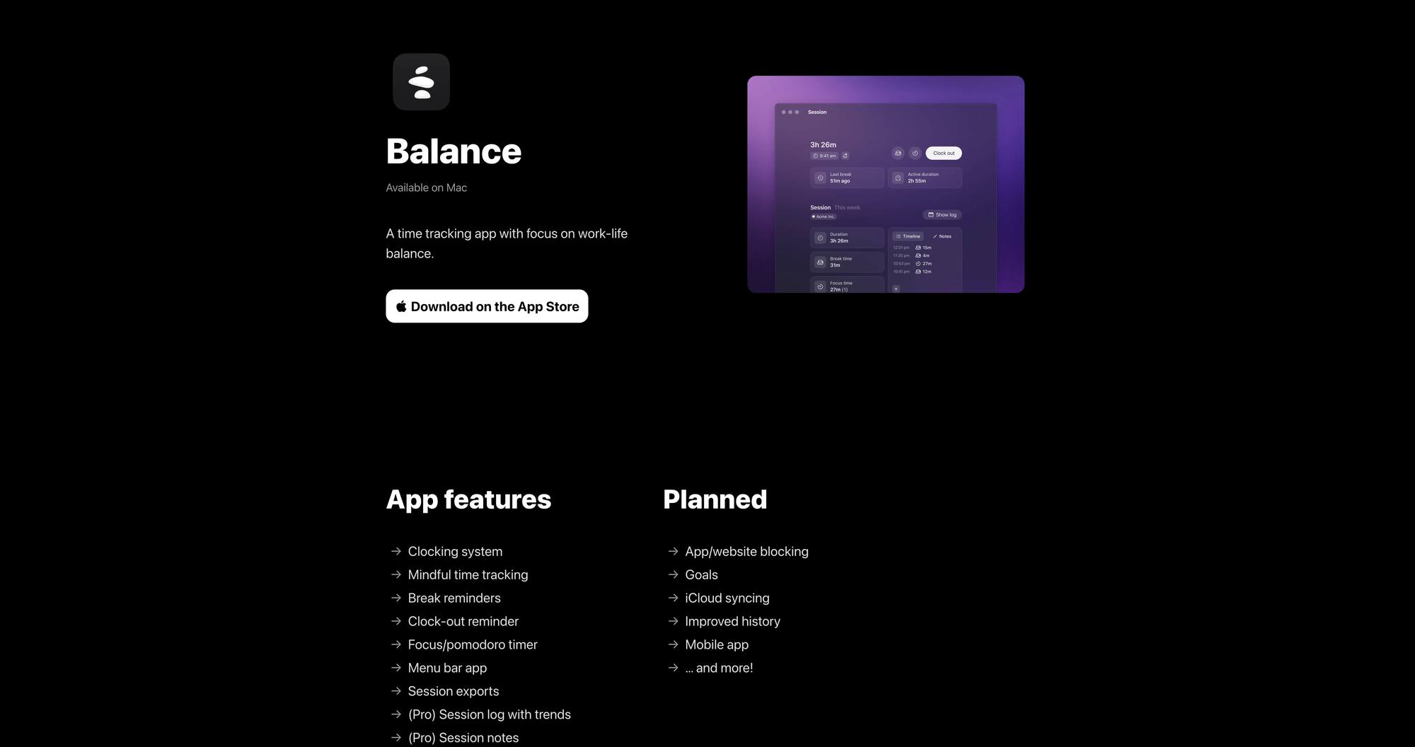
Since I started working remotely a year ago, I wanted to make sure to stick to working hours and keep track of them to make sure I have a healthy relationship between work and my personal life. Sometimes, working remotely, especially from a home office, a working day might not feel as structured as a day spent in an office with your colleagues. A result of that could be that you are working extra hours. To prevent that but also to keep track of how much time I spent in front of my computer, I decided to start using a time tracking app.
I was lucky enough to having found the perfect solution for my needs quick and easy, as Balance by Alexander Sandberg popped up on my timeline at the right time (fun-fact: Balance had been featured the very first issue of Creativerly of 2023, I started using Balance at the beginning of the past year, and it stuck with me since then). The first thing that immediately stood out to me was the design of Balance. It is the most beautiful piece of software in the category of time tracking apps, no doubt about that. Its design feels refreshing compared to all the other options available, which are mostly following conventional design decisions. But it is not only the design which immediately convinced me to add Balance to my tool stack. Packed with lovely and thoughtful features, Balance has managed to put together the time tracking app of my dreams, perfectly fitting my needs.
The clocking system is simple, streamlined, and straightforward. When you start your working day, clock in, when it is time for a break click on the coffee icon, the icon right next to it will start a new focus session based on the pomodoro technique. To make sure you are taking breaks regularly, Balance lets you set up break reminders. The session view gives you a neat overview of the duration of your working day, and the breaks and focus sessions you did. You also get a weekly overview, which gives you insights about your total session duration, earliest clock-in, total break duration, total focus duration, total active duration, and latest clock-out for each specific day.
In case you need session logs with trends, session notes, and workspaces and projects, you need to upgrade to Balance Pro which is, as of writing this, available for €2,49 per month or €25,99 per year. Alexander Sandberg has planned even more Pro features. Besides that, app/website blocking, goals, iCloud syncing, an improved history, and a mobile app can also be found on the roadmap. I am currently still on the free plan, since the features included cover all my needs, but since I want to support Alexander’s work, and make sure that Balance will operate for multiple years to come, I will soon upgrade to the Pro Plan.
Balance is a lovely, simple, and yet powerful mindful time tracking app I can recommend to everyone. Congrats Alexander and Balance, for becoming one of Creativerly’s favorite apps of 2023.


Discussion